0 members and 4,205 guests
No Members online

» Site Navigation

» Stats

Members: 35,443
Threads: 103,072
Posts: 826,684
Top Poster: cc.RadillacVIII (7,429)
|
-
-

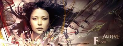
i like v3 bestm though the c4ds under her face look kinda low quality, other than that, the text is nice, though i would prefer it a little closer together. either way, nice job dude
-

yeah, 3 is the best. it's a bit chaotic though. some stuff on the left looks out of place. agreed with fuzer on text placement.
-

yea i had 3 fractal c4d's and 2 normal c4d's, so a lot going on. I do think it is a bit chaotic, and there was a lot of clipping masking going on as well  . Cheers for the C&C . Cheers for the C&C
Think you can beat my brutes?
-

right, changed text a bit, put a border on so i'll leave it as that.

Think you can beat my brutes?
-

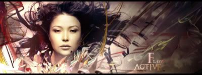
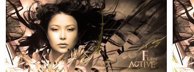
I like V2 a lot better just because it doesn't show the C4D's as much, it's more subtle.
Work on the text for sure, and change up the placement, try not to put text in the corners.
I also would have liked to see some more flow off of her hair, try to use that as a focal.
 Originally Posted by MarkPancake

MarkPancake banned.
Success.
-
-

Use the new V1 and then make it warmer, so it's more like the new V2 but not quite.
 Originally Posted by MarkPancake

MarkPancake banned.
Success.
-

okay.. i'll just stick with this.

Last edited by Active.; 06-15-2009 at 07:09 PM.
Think you can beat my brutes?
-

I like this one, it's monotone, but it's a good sort of monotone, mostly sepia. 
 Originally Posted by MarkPancake

MarkPancake banned.
Success.
Similar Threads
-
By flatty in forum Digital Art
Replies: 5
Last Post: 05-24-2009, 03:31 AM
-
By Immortal. in forum Support
Replies: 3
Last Post: 03-18-2008, 06:10 AM
-
By Chaotic Cow in forum Digital Art
Replies: 11
Last Post: 08-03-2007, 01:13 PM
-
By space-time in forum Digital Art
Replies: 2
Last Post: 01-07-2007, 03:38 PM
-
By Smiling Demon in forum Digital Art
Replies: 4
Last Post: 06-23-2006, 12:54 PM
 Posting Permissions
- You may not post new threads
- You may not post replies
- You may not post attachments
- You may not edit your posts
-
Forum Rules
|


