0 members and 501 guests
No Members online

» Site Navigation

» Stats
Members: 35,443
Threads: 103,072
Posts: 826,684
Top Poster: cc.RadillacVIII (7,429)
|
-
-

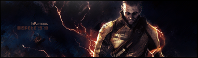
Looks alright, but the difference in colour between the render and the rest of the sig is too much.
The text should be a bit closer to the render.
Not much going on here, there aren't many effects, looks to me just like a few stocks.
 Originally Posted by MarkPancake

MarkPancake banned.
Success.
-
Originally Posted by Ptka
Looks alright, but the difference in colour between the render and the rest of the sig is too much.
The text should be a bit closer to the render.
Not much going on here, there aren't many effects, looks to me just like a few stocks.
I would quote for truth but you'd murder my soul. Have to agree that the colour difference is too much, and the whole thing seems far too blurry.

WetWorks
[system]|DoubleForte|TheFallen|Funndoo|Dungus|Chidori|Ritz |Unit_Number_43|Demon4|Kallen
-
Composition is off. The render is on the right grabbing all the attention leaving the sig feeling unbalanced.
Similar Threads
-
By AntiEmperor in forum Sigs & Manips
Replies: 6
Last Post: 08-16-2008, 11:10 PM
-
By Fork in forum Sigs & Manips
Replies: 2
Last Post: 08-14-2008, 05:56 AM
-
By Vaporizer in forum Sigs & Manips
Replies: 1
Last Post: 08-10-2008, 06:30 AM
-
By BreakaKai92 in forum Sigs & Manips
Replies: 3
Last Post: 04-05-2006, 02:04 PM
-
By .exploited in forum Digital Art
Replies: 1
Last Post: 03-12-2006, 03:13 PM
Tags for this Thread
 Posting Permissions
- You may not post new threads
- You may not post replies
- You may not post attachments
- You may not edit your posts
-
Forum Rules
|


 Reply With Quote


