0 members and 1,557 guests
No Members online

» Site Navigation

» Stats
Members: 35,443
Threads: 103,072
Posts: 826,684
Top Poster: cc.RadillacVIII (7,429)
|
-
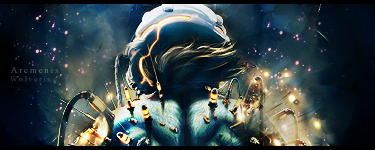
 One Last Hero One Last Hero
I tried to achieve alot more and better depth with this one so I left out most C4D action, and instead I used some splatter. I think I didn't do it perfectly but I do you think my depth skill is getting better. I'll leave the advice to you old pros.

CnC.
 Originally Posted by Slave
takken, you sweet boy you, i could eat you 6^
-
I can see what you were going with the depth, but you kind of lost the rest of it.
Maybe if the render wasn't so comical with those splatters this might have worked better.
The background being blurred is the best way to create depth, and you did that.
The splatters though, just seem unnecessary.
I would try and use only smudging on a sig, but try and find a render that has more perspective.
Then you can sharpen parts of the render, and blur the background so that it looks more "depthy". 
Originally Posted by MarkPancake

MarkPancake banned.
Success.
-
Originally Posted by Ptka
I can see what you were going with the depth, but you kind of lost the rest of it.
Maybe if the render wasn't so comical with those splatters this might have worked better.
The background being blurred is the best way to create depth, and you did that.
The splatters though, just seem unnecessary.
I would try and use only smudging on a sig, but try and find a render that has more perspective.
Then you can sharpen parts of the render, and blur the background so that it looks more "depthy".
As usual, I can rely one for good comments. Thanks.
Originally Posted by Slave
takken, you sweet boy you, i could eat you 6^
-
the effects are to random and there is no flow on this one.
The splatter doesnt go at all with this sig man, it looks like you
just added random stuff this sig. Not liking this at all
To add more depth you want your BG to make your Render stand out, right now
your render looks like its part of your BG and its not standing out at all.
Also try to make sure you stay with colors that work with your sig
that blue is just out of place. keep it up tho man, your flame on signature is A+
you should try and use the technique you used for that one more.
   <--Click baby eggs please! <--Click baby eggs please!
-
Originally Posted by Arcmenis
the effects are to random and there is no flow on this one.
The splatter doesnt go at all with this sig man, it looks like you
just added random stuff this sig. Not liking this at all
To add more depth you want your BG to make your Render stand out, right now
your render looks like its part of your BG and its not standing out at all.
Also try to make sure you stay with colors that work with your sig
that blue is just out of place. keep it up tho man, your flame on signature is A+
you should try and use the technique you used for that one more.
Thanks but the technique I used, uh... I forgot Besides, the render wouldn't correspond with any type of flow because of its position, action etc. So I decided to leave it out. Anyone that can show me how to please tell me. Besides, the render wouldn't correspond with any type of flow because of its position, action etc. So I decided to leave it out. Anyone that can show me how to please tell me.
Originally Posted by Slave
takken, you sweet boy you, i could eat you 6^
-
psst... i will tell u a good technique for superb death :P
after u have reached ur peak with goo sig, go to Filter>Other>High Pass, default value. go for any blending mode and erase what u dont like
blieve me its awesome :P
Fur's Gift BOOOO EVERYONE

-
Originally Posted by KidBuu
psst... i will tell u a good technique for superb death :P
after u have reached ur peak with goo sig, go to Filter>Other>High Pass, default value. go for any blending mode and erase what u dont like
blieve me its awesome :P
I'll keep that in mind. xD Thanks.
Originally Posted by Slave
takken, you sweet boy you, i could eat you 6^
-
I can see you are trying new things.
Firstly, the thing that this sig really lacks is a structured colour scheme. THere are blues, whites, browns, red.. makes it random.
You do not have to blur the BG all the time to bring out the focal.
I think its lacking flow because of the blue BG. Colours like, whites, creams, very light reds/pinks and some yellow would be a nice choice.
Text is okayy.
I can see you are trying to create a new style though which is good!
Keep it up and everything will come together eventually.
Think you can beat my brutes?
-
Originally Posted by Active.
I can see you are trying new things.
Firstly, the thing that this sig really lacks is a structured colour scheme. THere are blues, whites, browns, red.. makes it random.
You do not have to blur the BG all the time to bring out the focal.
I think its lacking flow because of the blue BG. Colours like, whites, creams, very light reds/pinks and some yellow would be a nice choice.
Text is okayy.
I can see you are trying to create a new style though which is good!
Keep it up and everything will come together eventually.
Another man who brings good comments. So colour choice helps flow eh? I'll remember that though I thought a sig don't needs flow all the time. Thanks all the same.
Originally Posted by Slave
takken, you sweet boy you, i could eat you 6^
-
Buu, that's a good technique, the High Pass filter is really good.
Originally Posted by MarkPancake
MarkPancake banned.
Success.
Similar Threads
-
By BonesMa in forum Sigs & Manips
Replies: 6
Last Post: 01-13-2009, 02:10 PM
-
By MartinBabies in forum Digital Art
Replies: 15
Last Post: 02-02-2008, 06:07 AM
-
By Virus in forum Digital Art
Replies: 7
Last Post: 01-08-2006, 04:19 AM
-
By Kyoushima in forum Digital Art
Replies: 6
Last Post: 11-08-2005, 05:21 PM
-
By OpticoN in forum Sigs & Manips
Replies: 7
Last Post: 08-22-2005, 03:20 AM
 Posting Permissions
- You may not post new threads
- You may not post replies
- You may not post attachments
- You may not edit your posts
-
Forum Rules
|


 Reply With Quote


