0 members and 5,276 guests
No Members online

» Site Navigation

» Stats
Members: 35,443
Threads: 103,072
Posts: 826,684
Top Poster: cc.RadillacVIII (7,429)
|
-
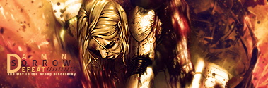
 Far Cry 2 Far Cry 2

Got stuck on text. I don't know about it. I don't think it looks terrible, but it isn't perfect.
Only difference, is the bottom one has a border.
Last edited by Karter; 06-21-2009 at 09:51 AM.
-
Firstly i prefer without the border. Try moving the text lower down near the hand and rotate it so its pointing parallel with the gun. Overall the sig is nice. BG is very good looking, and the splatters are neat. However, I think the render looks a bit oversaturated, idk looks a bit off.
Nice work though!
Think you can beat my brutes?
-
The flow is somewhat disrupted. The depth as well. Love the colours you used and the blending is pretty nice. The text... Bleh, it passes:P.
 Originally Posted by Slave
takken, you sweet boy you, i could eat you 6^
-
Just move the text straight down, so that it lines up with his mouth. You could have it go behind the guy so that his hand covers the bottom half of some text. Prefer without a border, though the bottom one's text looks way better because of its sharpness. Nice job though.
-
Good tag karter! The first thing i notice though is text palcement. For sure i agree with jeff. DEF move it down by his hands. Right now its wayy to distracting and ruins the focal point (his face).
The BG and effects are cool. Looks liek the apocolypse. And hes just liek a badass walking through it all. Good colors they match up well and lighting isnt bad either.
I agree drop the border and sharpen the etxt in the top on like you did to the second. nice usage of c4d and very good font choice. You did a smash job on that text.
 My DevART
RATCHET is my bitch
Andrew says:
u ever stolen a bible?
Apathy says:
no
used the last two pages to roll a joint though
Andrew says:
wow
thats fucking hard core
^^HAHAHA, dm sucks XD
-
Updated version at the top.
-
-
Farcry 2 is awesome, and I'm diggin this sig, nice!
 Posting Permissions
- You may not post new threads
- You may not post replies
- You may not post attachments
- You may not edit your posts
-
Forum Rules
|


 Reply With Quote


