0 members and 5,871 guests
No Members online

» Site Navigation

» Stats
Members: 35,443
Threads: 103,072
Posts: 826,684
Top Poster: cc.RadillacVIII (7,429)
|
-
 ColdPlay ColdPlay

opinions please!!
-
did't like the brushes PD i aint good at rating signatures
-
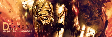
The right side is way to empty and it seems like you boxed in all the effects to the left. Let it free and spread some to the rest of the sig.
The colors, text (not turok) and lightning are nice. Keep working on it and It'll turn out great ^u^
Last edited by cc.RadillacVIII; 06-22-2009 at 12:10 AM.
-
I quite like the effects on the left, as Radillac said the right is a little empty, but a few c4d's would fix that.
The efx on the left, however, need to be blended with the guy more in order to make it look like they're actually coming off his back. Use distortion, blur, and maybe some angled strokes/other Artistic category filters to fix that.
The Turok text could be either deleted or change and the Coldplay text could be moved closer to the focal.
It seems like you really spammed that wonderful purple/orange default gradient, and while it is a WONDERFUL gradient map, be careful that it doesn't completely dominate your color scheme. Right now either he's eating too many carrots or you've done something with the color of his skin.

Et Tu?
SilentShadow | Jorrne | Arcmenis | Garis | Splinter | Sanbu | DeadlesS | Tekken | Proflax | Suddu
-
-
Maybe not so much effects on top of his left arm. It kind of ruins the depth a bit. The quality seems a bit low, and the lighting is off. Nice pen tooling.
-
Other than the monotone colours, it's pretty nice.
The effects are good and the text is pretty decent.
Not really liking the pen tooling and as I said, the colours could be vibrant and not dull.
 Originally Posted by MarkPancake

MarkPancake banned.
Success.
Similar Threads
-
By TaffyApple in forum Sigs & Manips
Replies: 6
Last Post: 02-05-2009, 01:31 PM
-
By ChrisDitter in forum The Void
Replies: 21
Last Post: 07-21-2005, 02:15 PM
-
By Gerwin538 in forum Digital Art
Replies: 0
Last Post: 07-03-2005, 02:33 PM
 Posting Permissions
- You may not post new threads
- You may not post replies
- You may not post attachments
- You may not edit your posts
-
Forum Rules
|


 Reply With Quote