GFXVoid Graphic Design Forum

Remove Text Formatting
Loading...

» Online Users: 5,026

0 members and 5,026 guests
No Members online

» Site Navigation

 > FAQ

» Stats

Members: 35,443
Threads: 103,072
Posts: 826,684
Top Poster: cc.RadillacVIII (7,429)
Welcome to our newest member, Lekelindids
Results 1 to 3 of 3

Thread: r&c

  1. #1
    Join Date
    Jun 2009
    Posts
    25

    Default r&c

    weird game :P


    CLICK

  2. #2
    Join Date
    Jul 2007
    Location
    Lithuania
    Posts
    3,611

    Default

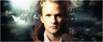
    first one: decent sig. dont like text placement much, snowflakes idea is great, but i find low quality of them, and bg looks low detailed.. but anyway. not bad sig.. didnt get the point how render and bg fits each other

    second: not much to said about is. similar to the first one...

    keep it up


  3. #3
    Join Date
    Jul 2008
    Location
    Vancity, Canada
    Posts
    2,985

    Default

    It's not bad, I don't like the text, and the background doesn't seem to fit the background, but the concept is good and the blending/smudging is good. :P
    But of course, it's NPH so it's awesome.
    Quote Originally Posted by MarkPancake View Post
    MarkPancake banned.
    Success.

Posting Permissions

  • You may not post new threads
  • You may not post replies
  • You may not post attachments
  • You may not edit your posts
  •  
Powered by vBadvanced CMPS v4.1.1