GFXVoid Graphic Design Forum

Remove Text Formatting
Loading...

» Online Users: 2,249

0 members and 2,249 guests
No Members online

» Site Navigation

 > FAQ

» Stats

Members: 35,443
Threads: 103,072
Posts: 826,684
Top Poster: cc.RadillacVIII (7,429)
Welcome to our newest member, Lekelindids
Results 1 to 3 of 3

Thread: GRAW2 Sig

  1. #1

    Default GRAW2 Sig


    CnC Please wasn't to sure bout the text tho


    Graphics Is More Than Just A Word, Or An Image, Its A Statement.


  2. #2
    Join Date
    Jun 2009
    Location
    Coeur d' Alene, ID
    Posts
    111

    Default

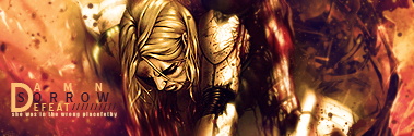
    It isn't bad. I don't like the black at the bottom left though. It cuts off too sharply. Try smudging or soft px erasing the edges of the render to blend into the background better.

    As for the text. It isn't terrible looking, but placed poorly. I wouldn't know what it said if your name wasn't on the forum.

  3. #3
    Join Date
    Jul 2008
    Location
    Vancity, Canada
    Posts
    2,985

    Default

    Not bad, but the colours are very monotone.
    Good work on a start with the background, but then it just drops off and there isn't much else happening.
    Some good things in this one, just try to make the whole canvas work, instead of just parts!
    Quote Originally Posted by MarkPancake View Post
    MarkPancake banned.
    Success.

Posting Permissions

  • You may not post new threads
  • You may not post replies
  • You may not post attachments
  • You may not edit your posts
  •  
Powered by vBadvanced CMPS v4.1.1