0 members and 5,279 guests
No Members online

» Site Navigation

» Stats
Members: 35,443
Threads: 103,072
Posts: 826,684
Top Poster: cc.RadillacVIII (7,429)
|
-
 2 Sigs and 1 vert 2 Sigs and 1 vert
Held back a few sigs for the Team Challenge.
Used a Tut for this one:


CnC Please. 
-
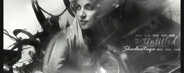
Not feeling the first one, im really not liking the colour scheme.
The second one i love, text is perfect, the effects are a little messy, but it works, nice job
Third one seems abit dull to me, i would have used more colour! other than that its pretty nice.
-
infact i love the bumble bee awesome distortion., the second one is kinda messy and rough
Fur's Gift BOOOO EVERYONE

-
 Originally Posted by Fuzer

Not feeling the first one, im really not liking the colour scheme.
The second one i love, text is perfect, the effects are a little messy, but it works, nice job
Third one seems abit dull to me, i would have used more colour! other than that its pretty nice.
I wan't too sure of the third one. I think it's the colours. They don't feel right. -_-
Oh, and here is the stock I used: http://wall.alphacoders.com/images/A...omen-43410.jpg
-
Love the vert so much 
glad the "ping" worked out well 
-
I don't like the first one, a think it's a bit confusing, imo.
the second one is very good, the effects, the color.
However, i think the best is the vert. I don't know why, but i just love it
-
omg , all 3 so damn cute .. i got nothing to add
for me they are awesome XD coolest,
transformers and that girl.. makes me melt
ps - please give me transformers stock or imma die here xDD
-
Originally Posted by Linda
omg , all 3 so damn cute .. i got nothing to add
lol i do. The vert looks more like a guy at first glance because of the colour scheme. It makes the Stock look very businessman-ish if you get what i mean. The BubbleBee sig i don't like simply because it looks too messy and rushed, and your focal isn't really a focal at all, also doesn't have much if any depth. It looks slightly like one C4D under a render with another C4D on top without any belnding at all. The second one though is good if verging on slightly Monotonous. Text is good, blends well and is fitting for the character. However there isn't a huge amount of flow, the flow should lead you back to the focal but it just doesn't but it is the best out of the three.
Similar Threads
-
By [system] in forum Sigs & Manips
Replies: 0
Last Post: 06-05-2009, 02:30 PM
-
By Fuzer in forum Sigs & Manips
Replies: 12
Last Post: 04-28-2009, 02:02 AM
-
By tekken in forum Sigs & Manips
Replies: 5
Last Post: 04-20-2009, 01:16 PM
-
By Gerrard in forum Sigs & Manips
Replies: 3
Last Post: 12-28-2008, 10:01 PM
-
By rchocobo in forum Sigs & Manips
Replies: 9
Last Post: 08-30-2005, 03:51 PM
 Posting Permissions
- You may not post new threads
- You may not post replies
- You may not post attachments
- You may not edit your posts
-
Forum Rules
|


 Reply With Quote