GFXVoid Graphic Design Forum

Remove Text Formatting
Loading...

» Online Users: 1,926

0 members and 1,926 guests
No Members online

» Site Navigation

 > FAQ

» Stats

Members: 35,443
Threads: 103,072
Posts: 826,684
Top Poster: cc.RadillacVIII (7,429)
Welcome to our newest member, Lekelindids
Results 1 to 8 of 8

Thread: Avatar of Light

  1. #1
    Join Date
    May 2009
    Location
    Reichstag
    Posts
    345

    Default Avatar of Light

    Latest stuff xD


    v2


    v3


    Cnc mens

  2. #2
    Join Date
    Mar 2008
    Location
    Denmark
    Posts
    204

    Default

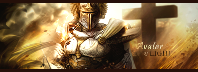
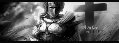
    Looks very good to me. v2 dosent work at all.

    But the decision is between v1 and v3 :P Good job

    SOTW Entry:

    ZOMG?!


  3. #3
    Join Date
    Sep 2008
    Posts
    1,589

    Default

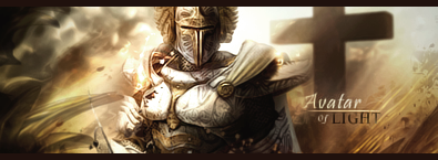
    I like the adjustments in V3 nice work

  4. #4
    Join Date
    Jun 2009
    Location
    Utrecht, Netherlands
    Posts
    92

    Default

    Nice use of color, but I don't really like the blending (or the lack of it). Nice flow though. And with a bit more depth it would be even better.


    F A V O R I T E


    L A T E S T
    Et Tu?
    SilentShadow | Jorrne | Arcmenis | Garis | Splinter. | Miril | DeadlesS | Tekken | Julian |
    -


  5. #5
    Join Date
    Nov 2008
    Location
    West Orange, New Jersey
    Posts
    329

    Default

    I would get rid of the cross if I were you. (Don't take this the wrong way, now)
    Latest:


  6. #6
    Join Date
    Jan 2009
    Location
    Northamptonshire, England
    Posts
    294

    Default

    Nice job on the lighting. It works very well.
    I personally like V1 a lot more since I like a bit more vibrancy.
    I guess you could take that thing out of the bottom left corner as that isn't really doing anything for me.
    Text is decent too.

    Keep it up!

  7. #7
    Join Date
    Feb 2009
    Location
    Portsmouth
    Posts
    2,970

    Default

    I think Version 3, version 1 looks too dark for the light thing. Nice job though, keep it up!

  8. #8
    Join Date
    May 2009
    Location
    Reichstag
    Posts
    345

    Default

    thanx for comments ;p

    cross is part of the stock lulz, the way i work i would have to redo all the sig from scratch to remove that i added it to suit holy theme

    as for the depth i know its could be way better, ill try to fix that later!

Similar Threads

  1. To The Light
    By zole in forum Sigs & Manips
    Replies: 10
    Last Post: 04-04-2009, 11:33 AM
  2. Light:)
    By ministaci in forum Sigs & Manips
    Replies: 6
    Last Post: 09-19-2008, 08:54 PM
  3. Light
    By Immortal. in forum Sigs & Manips
    Replies: 12
    Last Post: 08-26-2008, 05:42 AM
  4. Light
    By Nightfire in forum Sigs & Manips
    Replies: 6
    Last Post: 10-14-2005, 11:30 AM
  5. Ray of light
    By HeadShot in forum Digital Art
    Replies: 8
    Last Post: 09-06-2005, 08:51 AM

Posting Permissions

  • You may not post new threads
  • You may not post replies
  • You may not post attachments
  • You may not edit your posts
  •  
Powered by vBadvanced CMPS v4.1.1