0 members and 3,973 guests
No Members online

» Site Navigation

» Stats
Members: 35,443
Threads: 103,072
Posts: 826,684
Top Poster: cc.RadillacVIII (7,429)
|
-
 [Prototype] [Prototype]
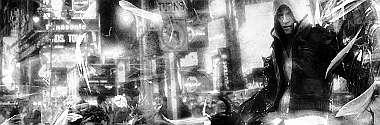
CnC please.
And no, this isnt my first.
-
i think that the render is lq mabye u made a effect on it but it looks lq to me mabye more smudging and blending could help you =]
-
I think it's very chaotic and the focal doesn't stand out enough. Also, it's too small and tucked away.
-
 Originally Posted by RussiA

i think that the render is lq mabye u made a effect on it but it looks lq to me mabye more smudging and blending could help you =]
Thanks.
@Carnage: It is? Seems big enough too me...
-
It's tucked away on the right side of the signature whilst in the centre and to the left you have the city which is what is attracting my attention, not the main supposed to be focal.
-
I understand what your saying fully.
Any way too stop that rather then making the focal bigger or moving it to the left?
-
To be honest, your asking the wrong person. xD I'm not that good with signatures, let alone black and white. Your best of asking someone else. Someone else that visits this post may be able to help you. I mean, look at my piece in signature, that's my best. xD
-
the sig is way too chaotic, the B/W contrast is overdone and the render is not blending into it,
the whole city is bright and the render is dark.
Here's what you do to improve it
When making signatures from stocks like a city or forest, you always have to chose the colors of your render and make sure you blend the bg into render colors.
if the city is too chaotic sapm it with c4d's around ur render so that the bg is less seen and focal comes out
now its not always necessary to make a render big to make it a focal.
A focal comes out when you target a particular place and do effects around it leaving that place alone.
as such that place is empty it attracts more attention to our eyes, since everything is affcted by effects except that empty place. say or e.g. take my sig, i added c4d's splatters and what not, but i dint even touch the face, so u can see it clearly rather than other parts of prime.
when making sig out of city stocks, first think you do is a proper choice of renders. you dont take any damn render, try to blend it forcefully into the bg, Thats the reason the sig becomes chaotic. coz u randomly splatter c4d's here and there.
I think you got what i said, Keep the good work up andtry becoming better 
Oh and a tip of advice...... First go for color sigs rather than B/W coz if you dont understand the difference in contrast then B/W sigs are out of question, coz thats what they contain, contrast! 
Fur's Gift BOOOO EVERYONE

-
Seems a bit too chaotic, and i think the focal is rather small aswell, it also looks rather LQ, i'd like to see a colour version aswell..
"Imagination Is More Important Than Knowledge"
Latest

Favourite
 "Together We Stand Strong"
-
The color will make your eyes bleed, i assure you.
Similar Threads
-
By Arcmenis in forum Sigs & Manips
Replies: 4
Last Post: 06-24-2009, 11:09 PM
-
By Killa_GFX in forum Sigs & Manips
Replies: 2
Last Post: 06-14-2009, 05:06 PM
-
By tekken in forum Sigs & Manips
Replies: 1
Last Post: 03-29-2009, 03:15 PM
-
By Lew in forum Sigs & Manips
Replies: 5
Last Post: 02-11-2009, 03:34 PM
-
By Newton in forum Sigs & Manips
Replies: 3
Last Post: 01-20-2009, 03:28 AM
 Posting Permissions
- You may not post new threads
- You may not post replies
- You may not post attachments
- You may not edit your posts
-
Forum Rules
|


 Reply With Quote
 YE BOY!!


