0 members and 2,903 guests
No Members online

» Site Navigation

» Stats

Members: 35,443
Threads: 103,072
Posts: 826,684
Top Poster: cc.RadillacVIII (7,429)
|
-
 Complete photoshop amateur here: tell me how to improve this signature Complete photoshop amateur here: tell me how to improve this signature
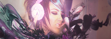
I'd consider myself a complete newbie to photoshop (even though I've been using it for awhile) and this is the first signature I've made that I think is decent to look at: 
Even so, I know it's missing alot and I feel that maybe there isn't enough blending or that it is too bright or maybe that it's complete trash. Anyways, if anyone can post some suggestions to make this a better looking signature, I'll take those suggestions and repost the changes I made, respectively. Thanks in advance
-

The effects look good, and the text is alright, but it way too over contrasted
And the splatters seem too sharp, just lower the opac on the sharpen layer.
"Imagination Is More Important Than Knowledge"
Latest

Favourite
 "Together We Stand Strong"
-

 Originally Posted by iNova

The effects look good, and the text is alright, but it way too over contrasted
And the splatters seem too sharp, just lower the opac on the sharpen layer.
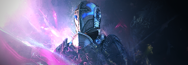
Thanks for the input. I lowered the opacity on the photofilter that made the splattered part seem so bright and also lowered the opacity on the sharpened layer and this is what I got:
Do you think that the splatters are still too sharp?
-

It looks a better now, But the splatter to the left of the render is still too sharp, try using the blur tool.
"Imagination Is More Important Than Knowledge"
Latest

Favourite
 "Together We Stand Strong"
-

 Originally Posted by iNova

It looks a better now, But the splatter to the left of the render is still too sharp, try using the blur tool.
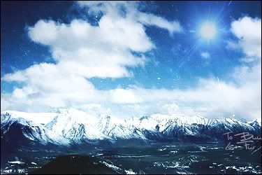
Thanks again, I see what you meant when you said my splatter was "sharp" and so I have blurred it slightly. Also, I've added a few more C4D's because I thought the area to the left was a bit too boring. I also sharpened the text. This is the newest result

-

I don't really know a lot, but I like the text. Good choice and placement. I've said that like twice since I joined.
 Thanks.
Prick.
-

 Originally Posted by Dark Method

I don't really know a lot, but I like the text. Good choice and placement. I've said that like twice since I joined.
Wow, that's a huge compliment. Thank you 
-

absolute lack of depth. use blurs to create depth for beginning
sharpend some areasand blur some, that will make it look cool
its too monotonish imo
red it overlaping the tag.
and the text is too big there, minimize the size of the font
Fur's Gift BOOOO EVERYONE

-

 Originally Posted by KidBuu

absolute lack of depth. use blurs to create depth for beginning
sharpend some areasand blur some, that will make it look cool
its too monotonish imo
red it overlaping the tag.
and the text is too big there, minimize the size of the font
Well I followed your advice, mostly. I added in shades of yellow, orangeish, red, and light red/pink to slightly kill the monotone, minimalized the size of the text, and blurred/sharpened the picture to slightly add depth. I do feel like I overdid the blurring/sharpening but this the result. Thanks for your input, KidBuu.

-

 Originally Posted by Dark Method

I don't really know a lot, but I like the text. Good choice and placement. I've said that like twice since I joined.
I'd have to disagree. That font "something cowboys?" is horrid and should never be used. The placement is ok but the font is too big also.
Similar Threads
-
By Valkyr in forum Sigs & Manips
Replies: 7
Last Post: 06-22-2009, 02:31 PM
-
By yusuke280 in forum Digital Art
Replies: 0
Last Post: 05-19-2008, 01:38 AM
-
By Velocity in forum Digital Art
Replies: 2
Last Post: 06-22-2007, 08:18 AM
-
By mrlunget in forum Digital Art
Replies: 7
Last Post: 12-02-2005, 11:04 PM
-
By Tenchido in forum Sigs & Manips
Replies: 4
Last Post: 07-24-2005, 05:43 PM
 Posting Permissions
- You may not post new threads
- You may not post replies
- You may not post attachments
- You may not edit your posts
-
Forum Rules
|


 Reply With Quote
