0 members and 760 guests
No Members online

» Site Navigation

» Stats
Members: 35,443
Threads: 103,072
Posts: 826,684
Top Poster: cc.RadillacVIII (7,429)
|
-
 Dead Space Tag! Dead Space Tag!
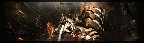
Hia guys! Got any suggestions for me? Perhaps something I could do with the text?
-
This would be much better if the canvas weren't as large on the sides, and the render was flipping around so that it flowed with the background.
And the text could do with a change-up, lower it so that it's in line with one of the three eyes. 
And make sure that it's not just black. Try a smoother font..
 Originally Posted by MarkPancake

MarkPancake banned.
Success.
-
Originally Posted by Ptka
This would be much better if the canvas weren't as large on the sides, and the render was flipping around so that it flowed with the background.
And the text could do with a change-up, lower it so that it's in line with one of the three eyes.
And make sure that it's not just black. Try a smoother font..
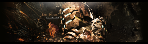
Are talking about something like this?
-
Yes but something looks off about it now.
Make sure that there is more contrast between the render and the background.
Maybe try dodging and burning.
Originally Posted by MarkPancake
MarkPancake banned.
Success.
-
i agree, canvas to big o.o and text need some work, u know, close to focal, so it dont distrack it?, sig is too dark,but if u could do it more lighter i think u wouldnt have any problem with text  but this far realy nice,keep it up but this far realy nice,keep it up
-
just crop of the sides and it will be as good
Fur's Gift BOOOO EVERYONE

Similar Threads
-
By Ritz in forum Sigs & Manips
Replies: 8
Last Post: 04-28-2009, 05:38 AM
-
By smallboss in forum Sigs & Manips
Replies: 3
Last Post: 03-04-2009, 12:16 PM
-
By Miyagi13 in forum Sigs & Manips
Replies: 5
Last Post: 01-06-2009, 09:56 PM
-
By Firescorpio in forum Sigs & Manips
Replies: 4
Last Post: 12-13-2008, 10:31 AM
-
By ratchetnclank in forum Sigs & Manips
Replies: 11
Last Post: 08-20-2008, 01:18 AM
 Posting Permissions
- You may not post new threads
- You may not post replies
- You may not post attachments
- You may not edit your posts
-
Forum Rules
|


 Reply With Quote


