GFXVoid Graphic Design Forum

Remove Text Formatting
Loading...

» Online Users: 1,792

0 members and 1,792 guests
No Members online

» Site Navigation

 > FAQ

» Stats

Members: 35,443
Threads: 103,072
Posts: 826,684
Top Poster: cc.RadillacVIII (7,429)
Welcome to our newest member, Lekelindids
Results 1 to 7 of 7
  1. #1
    Join Date
    Jan 2007
    Posts
    43

    Default DREAM (USED SHANE's Stock)

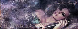
    Thought i would try playing aroound with the pic shane uploaded. I know it isn't that great but i was eperimenting with different ideas i found from different tuorials. C&C please! thanks.


  2. #2
    Join Date
    Jul 2009
    Posts
    383

    Default

    looks pretty good dude keep it up im going to make an other sig and upload the render and see other peoples outcomes you should do it

  3. #3
    Join Date
    Jan 2007
    Posts
    43

    Default

    Yeah i will give it shot.


  4. #4
    Join Date
    Sep 2008
    Location
    Australia
    Posts
    2,310

    Default

    Overall... Looks great, except I think this has a case of FHS (Floating Head Syndrome)

    Your brushwork and the light effects are quite nice. I also like how "Dream" enters that circle shape. It's just the head that brings it down. The girl's head is just... there. It doesn't interact with the background in any way, and it looks like it was just place on the sig.

  5. #5
    Join Date
    Mar 2009
    Location
    Latvia
    Posts
    2,381

    Default

    hey thats a great one , but right side looks bit empty O.o but i love the effects, Great job!


  6. #6
    Join Date
    Dec 2008
    Location
    Gujrat, India
    Posts
    1,926

    Default

    thats an FHS
    Fur's Gift BOOOO EVERYONE


    Apathy and i talk shit about everything.
    Kritez you have unyil yomottoe
    KidBuu is that latin?
    Kritez yes

    [DeviantART] [GrayMoon Studios]

  7. #7
    Join Date
    Jul 2009
    Location
    BC, Canada
    Posts
    450

    Default

    Its good.. i think it needs something more to it..its a little darker on the right side.i think theres should be more lighting there.. just my opinion.. i like the BG though.. nice job.


Similar Threads

  1. Replies: 15
    Last Post: 03-30-2010, 08:57 PM
  2. Dream
    By Freedom in forum Sigs & Manips
    Replies: 3
    Last Post: 03-20-2008, 06:43 AM
  3. Dream
    By Light in forum Digital Art
    Replies: 8
    Last Post: 12-04-2006, 03:39 PM
  4. h0t :: dream
    By arson™ in forum Digital Art
    Replies: 14
    Last Post: 01-25-2006, 08:43 PM
  5. Dream...
    By SeasonalWeasel in forum The Void
    Replies: 5
    Last Post: 10-31-2005, 04:47 AM

Posting Permissions

  • You may not post new threads
  • You may not post replies
  • You may not post attachments
  • You may not edit your posts
  •  
Powered by vBadvanced CMPS v4.1.1