0 members and 2,216 guests
No Members online

» Site Navigation

» Stats
Members: 35,443
Threads: 103,072
Posts: 826,684
Top Poster: cc.RadillacVIII (7,429)
|
-
 Fly With Style Fly With Style
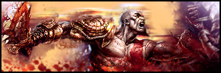
My first piece in about 6-7 months, or more I can't remember. Let me know what you think, be nice though heh. Cheers.

-
..::Favorite::..

..::Newest::..
-
style is good.. to much brightness, left side needs something more to much black. render could use some brush work.. not bad sig.. 
-
text is really good. left side is a bit blank and the lightingon the right seems forced. but goodjob. 
-
Looks great! just needs a bit more blending and some more c4ds to fill in that black.
Nice job!
...::Favorite::...

...::SOTW 180 Entry::...
 "Even the smallest of things can make the biggest difference."
-
simple but nice.
I like the lighting effects.
-
The flow is great and the lighting is really cool. Text fails and the left side is a bit bare but it is cool piece. Like it.
 Originally Posted by Slave
takken, you sweet boy you, i could eat you 6^
-
text works but i think sig is way to dark, but i like the light and colour
-
its nice man i love the text and i wish there was more to the sig on the left side and maybe not as bright on the right side but its still good
-
Hey guys, you're right the right side does look a little dead, but what would you put there to make it work and not ruin the feel of the piece, or clutter it up at all. I'm open for suggestions but I don't wanna crowd it up or ruin it. Thanks alot though for all the input, really appreciate it.
Similar Threads
-
By Shadow379 in forum Sigs & Manips
Replies: 3
Last Post: 07-13-2009, 09:37 AM
-
By SpYdaBoi in forum Sigs & Manips
Replies: 2
Last Post: 06-26-2008, 10:41 AM
-
By SpYdaBoi in forum Sigs & Manips
Replies: 5
Last Post: 06-14-2008, 07:55 PM
-
By SpYdaBoi in forum Sigs & Manips
Replies: 3
Last Post: 06-10-2008, 06:28 PM
-
By Adam in forum Sigs & Manips
Replies: 1
Last Post: 03-16-2006, 12:53 AM
 Posting Permissions
- You may not post new threads
- You may not post replies
- You may not post attachments
- You may not edit your posts
-
Forum Rules
|


 Reply With Quote