0 members and 881 guests
No Members online

» Site Navigation

» Stats
Members: 35,443
Threads: 103,072
Posts: 826,684
Top Poster: cc.RadillacVIII (7,429)
|
-
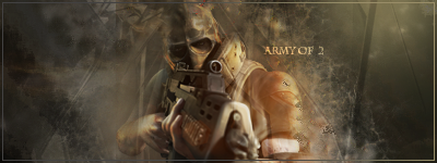
 Army of 2 Army of 2
CnC please.
-
I think your render needs sharpened some, seems a bit blurry. Also move it over some so it's not dead center. Lighting would improve it a lot.
-
-
Hmmm, I like the concept, one of the best in a while. Not too sure if you knew where you were going with this one though.
The effects are cool and the smudging or w/e it is, it looks great! THe focal doesn't stand out at all though. Sharpen the main focal and the sig becomes really good.
Nice piece otherwise.
 Originally Posted by Slave
takken, you sweet boy you, i could eat you 6^
-
Good one. i dont like the colors though
Similar Threads
-
By Church© in forum Sigs & Manips
Replies: 2
Last Post: 07-15-2008, 05:09 PM
-
By GreyH in forum Digital Art
Replies: 7
Last Post: 07-12-2008, 08:42 AM
-
Replies: 29
Last Post: 06-13-2007, 09:47 AM
-
By imported_bAy in forum Sigs & Manips
Replies: 6
Last Post: 01-17-2007, 09:15 AM
-
By Octavius in forum Sigs & Manips
Replies: 0
Last Post: 10-11-2005, 12:40 AM
 Posting Permissions
- You may not post new threads
- You may not post replies
- You may not post attachments
- You may not edit your posts
-
Forum Rules
|


 Reply With Quote