GFXVoid Graphic Design Forum

Remove Text Formatting
Loading...

» Online Users: 3,778

0 members and 3,778 guests
No Members online

» Site Navigation

 > FAQ

» Stats

Members: 35,443
Threads: 103,072
Posts: 826,684
Top Poster: cc.RadillacVIII (7,429)
Welcome to our newest member, Lekelindids
Results 1 to 6 of 6
  1. #1
    Join Date
    Aug 2009
    Posts
    19

    Smile Back with a new tag..

    CnC Please...


  2. #2
    Join Date
    Aug 2009
    Location
    jamaica
    Posts
    520

    Default

    should remove the hulk text or change it somehow. others who don't know would think you just slapped your hulk text on someone's else sig but gj.

  3. #3
    Join Date
    Aug 2009
    Location
    Lithuania
    Posts
    531

    Default

    Somehow I have a suspicion that the ghost rider is a rip.


  4. #4
    Join Date
    Aug 2009
    Posts
    19

    Default

    what the hell are you guyz talking about???...rip???..what do that mean?..
    i stole it?...i did it myself....stupid if i took it from someone

  5. #5
    Join Date
    Sep 2008
    Location
    Australia
    Posts
    2,310

    Default

    Quote Originally Posted by xInSaNex View Post
    Somehow I have a suspicion that the ghost rider is a rip.
    I've seen the source image before, but that doesn't mean this sig is a Rip.

    I have seen several sigs on a heap of forums that look very similar. Some of them look like tutorial sigs... but upon comparing the versions there are usually subtle differenced that show that they are not a rip.
    You may be confusing yourself with another image.

    In saying that, if you do think something is a rip, send me a PM with the accused signature image (and if possible, the ripped signature image) and I'll look into the matter.
    __________________

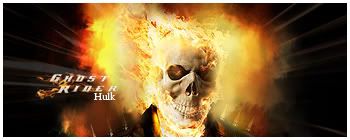
    The image is alright. The fire effects are a bit smudgy and lose their impact. In future, you might get a better effect by using fire stock images and setting them to a 'screen' type of blending mode. I've done that before on a wallpaper and it looks awesome.
    Your Hulk text is also a bit out of place. Instead of white, add an orange colour to it to soften the glow.

  6. #6
    Join Date
    Aug 2009
    Location
    Lithuania
    Posts
    531

    Default

    Well, I touth that that's a rip just because the hulk text is looks really wierd.


Similar Threads

  1. IM BACK
    By cloud260 in forum Digital Art
    Replies: 17
    Last Post: 12-27-2005, 05:04 PM
  2. I AM BACK
    By Soul in forum Digital Art
    Replies: 1
    Last Post: 08-04-2005, 02:49 AM
  3. back
    By kompakt in forum The Void
    Replies: 5
    Last Post: 08-03-2005, 04:21 PM
  4. Im back
    By Delphic in forum Introductions
    Replies: 1
    Last Post: 08-03-2005, 01:54 PM
  5. Hmm, back two new
    By narcosynthesis in forum Digital Art
    Replies: 3
    Last Post: 07-29-2005, 06:44 PM

Posting Permissions

  • You may not post new threads
  • You may not post replies
  • You may not post attachments
  • You may not edit your posts
  •  
Powered by vBadvanced CMPS v4.1.1