0 members and 5,808 guests
No Members online

» Site Navigation

» Stats
Members: 35,443
Threads: 103,072
Posts: 826,684
Top Poster: cc.RadillacVIII (7,429)
|
-
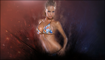
 Rebeca Smoking HOT Rebeca Smoking HOT
My first signature in a really long time ^u^ What do you guys think about it?

-

i think stock is to small for this size canvas. It makes sides look empty,tho i like the colours and effects, but it looks like missing something, i think u need add something..
-maybe more colours
-more visible c4d
-cliping masks?
 tho its really nice work.GJ tho its really nice work.GJ
-
kinda too plain don't you think? i mean there isn't much too it, like no effects and stuff
-
I like the blending and smudging.. The render looks a little thin like Linda mentioned.. i think it could use some light effect not alot but i think it needs a little.. Maybe fill in some empty spots.. Very nicely done so far..
-
Thank you for the comments 
Yeah I do agree that it looks a little empty. Gonna look into what I can do about it tonight ^u^
...
V.2 has arrived:
Anymore Comments?
I think the right still needs some more work, but this is all I had time to do today ^u^
Last edited by Nutter; 08-11-2009 at 01:51 AM.
Reason: Merged Post
-
She is hot but not hot enough for me  . Jk. I like the colours, what is the black thing at the bottom? . Jk. I like the colours, what is the black thing at the bottom?
-
Thanx man 
The black thing goes with the black lines, It's like smoke but even darker
-
Ah, i see. Tis very nice well done.
-
WOW, LOOK AT THE SIZE OF THOSE -
Sorry.
Not bad, but I do think it's a bit too empty though I like the concept you were going for.
Keep it up.
Similar Threads
-
By .TheMentalists. in forum Sigs & Manips
Replies: 10
Last Post: 08-04-2009, 12:34 PM
-
By agertz in forum Digital Art
Replies: 4
Last Post: 01-05-2008, 06:25 AM
-
By DChild in forum Digital Art
Replies: 4
Last Post: 08-01-2007, 10:47 AM
-
By stanx in forum Digital Art
Replies: 7
Last Post: 03-04-2007, 11:12 AM
-
By Dick in forum The Void
Replies: 65
Last Post: 09-14-2005, 02:41 PM
 Posting Permissions
- You may not post new threads
- You may not post replies
- You may not post attachments
- You may not edit your posts
-
Forum Rules
|


 Reply With Quote


