0 members and 345 guests
No Members online

» Site Navigation

» Stats
Members: 35,443
Threads: 103,072
Posts: 826,684
Top Poster: cc.RadillacVIII (7,429)
|
-
 2S 2S
 I need less friends, more bread. Less talk, more head.
Battle Record 5-1
-
Like i said, very nice i like 1 to 2
-
Very nice work... i like the flow the colors go nice.. Good job!!
-
Thanks guys
I need less friends, more bread. Less talk, more head.
Battle Record 5-1
-
I need less friends, more bread. Less talk, more head.
Battle Record 5-1
-
this is great man, JUST GREAt! the text, the colors - love everything about it lol
-
-
I like the overall style and feel of your tags. I also like what you do with your borders.
The main thing you need to do is just lighten up on the topaz some. Sometimes it just make the piece look weird.
-
it was the way the render came, thats why the sig looks like that
I need less friends, more bread. Less talk, more head.
Battle Record 5-1
-
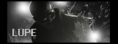
i love the 1st one colors are great and the toonish feel of the render 2nd one is good but i dont like lupe lol
 Posting Permissions
- You may not post new threads
- You may not post replies
- You may not post attachments
- You may not edit your posts
-
Forum Rules
|


 Reply With Quote


