GFXVoid Graphic Design Forum

Remove Text Formatting
Loading...

» Online Users: 3,469

0 members and 3,469 guests
No Members online

» Site Navigation

 > FAQ

» Stats

Members: 35,443
Threads: 103,072
Posts: 826,684
Top Poster: cc.RadillacVIII (7,429)
Welcome to our newest member, Lekelindids
Results 1 to 7 of 7
  1. #1
    Join Date
    Jul 2009
    Location
    Los Angeles
    Posts
    56

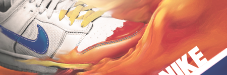
    Default Nike, First Sig in weeks...

    Haven't made a sig in forever, and don't plan to make too many of them, this is so so for me, I tried new stuff so I expect to get negative cnc.


  2. #2
    Join Date
    Apr 2009
    Location
    Melbourne Australia
    Posts
    39

    Default

    looks like gimp no?


  3. #3
    Join Date
    Jul 2009
    Location
    Los Angeles
    Posts
    56

    Default

    nope i dont use gimp lol, but thanks, gives me a perspective of how much worse I have gotten to give the impression that I used gimp.

    I did a lot of smudging and playing with artistic and brush strokes filters.


  4. #4
    Join Date
    Aug 2009
    Location
    jamaica
    Posts
    520

    Default

    nice smudge, really flows. gj

  5. #5
    Join Date
    Apr 2009
    Location
    Melbourne Australia
    Posts
    39

    Default

    naw the whole style of it seems like gimp, the smudging and filters look really good I like it.

    improvements? maybe work on the splash over the shoe, thats about it honestly i really like the style


  6. #6
    Join Date
    Sep 2008
    Location
    Australia
    Posts
    2,310

    Default

    Quote Originally Posted by implement View Post
    looks like gimp no?
    Never judge an artwork by it's program. I've seen some artworks made in 'MS Paint' that would give many people a run for their money.

    I like how the flame effects are sort of painted into the image. It's something a bit different and unusual.
    The Nike should be moved up a bit so that more of the N is seen. At the moment it looks like Vike.
    Under the shoe, I think the painted orange triangle area should be darker so it's more like a shadow. Go for more of a brown colour if you need to.
    Lastly, have you thought about a border of any kind.

    Sorry for the comments. I do like it, it's just these little things that may take it up a notch or two.

  7. #7
    Join Date
    Jul 2009
    Posts
    383

    Default

    to tell you the truth i like it i just dont like how you cut off the N :/

Similar Threads

  1. Been a few weeks..
    By Elramo in forum Sigs & Manips
    Replies: 7
    Last Post: 10-27-2008, 06:55 AM
  2. First in around 2 weeks.
    By gadget in forum Digital Art
    Replies: 6
    Last Post: 05-25-2006, 12:51 PM
  3. nice nike
    By Kilvo in forum Digital Art
    Replies: 14
    Last Post: 04-10-2006, 05:03 PM
  4. Nike SB Dunks
    By Tabris in forum Digital Art
    Replies: 2
    Last Post: 04-06-2006, 03:55 PM
  5. first sig in like 2 weeks
    By 5lave in forum Sigs & Manips
    Replies: 6
    Last Post: 08-04-2005, 03:52 PM

Posting Permissions

  • You may not post new threads
  • You may not post replies
  • You may not post attachments
  • You may not edit your posts
  •  
Powered by vBadvanced CMPS v4.1.1