GFXVoid Graphic Design Forum

Remove Text Formatting
Loading...

» Online Users: 3,627

0 members and 3,627 guests
No Members online

» Site Navigation

 > FAQ

» Stats

Members: 35,443
Threads: 103,072
Posts: 826,684
Top Poster: cc.RadillacVIII (7,429)
Welcome to our newest member, Lekelindids
Results 1 to 5 of 5

Thread: Zell

  1. #1
    Join Date
    May 2007
    Location
    Satan's bung hole, AZ
    Posts
    7

    Cool Zell

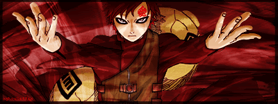
    So I made this for my husband, made it for his Spray on Counter Strike: Source. His name thingy on there is Zell, so I figured why not.

    What do you guys think?


    I just realized I forgot the border on it. I'll have to fix that later.


  2. #2
    Join Date
    Feb 2009
    Location
    Portsmouth
    Posts
    2,970

    Default

    It's a bit big for his tag. I play the game and it's going to be look too pixelated. The effects aren't too bad, the lines and that but the background is pretty horrid.

  3. #3
    Join Date
    May 2007
    Location
    Satan's bung hole, AZ
    Posts
    7

    Default

    I know its going to be to be big, I resized it so it would fit for him, but it was really kind of small to post.

    What about the background is so bad?


  4. #4
    Join Date
    Sep 2008
    Location
    Australia
    Posts
    2,310

    Default

    Quote Originally Posted by xghouliettex View Post
    What about the background is so bad?
    There isn't really enough to help link the character to the background. You've gotten the Pen Tool lines happening around the place, which looks cool, but it doesn't feel like that is enough.
    I think some work needs to be done around the character to blend it into the background. The Smudge brush, normal brush and blending modes can help you along with this. Even some clipping masks would look good. It's just adds some more detail for the viewer to look at, rather than glance at it, and thinking, "Is there more?" or "I would like to see more."

  5. #5
    Join Date
    Jul 2009
    Location
    BC, Canada
    Posts
    450

    Default

    Needs some more fx maybe.. and the back of your render you can see at the bottom needs some brush work and some smudging so you dont have the line boarder effect... But Descent concept.. Keep working at it.. Lots of tutorials to work with..... Nice effort..


Tags for this Thread

Posting Permissions

  • You may not post new threads
  • You may not post replies
  • You may not post attachments
  • You may not edit your posts
  •  
Powered by vBadvanced CMPS v4.1.1