0 members and 348 guests
No Members online

» Site Navigation

» Stats
Members: 35,443
Threads: 103,072
Posts: 826,684
Top Poster: cc.RadillacVIII (7,429)
|
-
 first attempts :P first attempts :P
ok im fairly new here and i havent been doing this for soo long. using the webisite i am getting used to features in CS3 and i think i done ok for my first attemps personnally my last is my best but please comment with help on how to improve :P


i like my last 1 the best but help would be loved :P
-
hmm well you can always try the basics like smudging and stuff andd try using W340xH120 in ps but those could be great for wallpaper xD
-
For a first a attempt they're okay. You Optimus one is fine. The text isn't working for me though. Hit up some tutorials you'll learn alot from them

My Three Rules Of Making a Sig Flow, Lighting and Depth
-
Some Tips :
Use smaller size. U know U always can resize renders and Bg's?
if U dont know how then -
1. chose render on layer palete
2. press EDIT and go down to - FREE transform
3 press shift and hold it while u resize it.
Same as You can just resize all sig, canvas by pressing CTRL+ALT+i
Try some Blending it:
Erase renders sides a little so it "connect's" with background
or smudge sides and the edges a bit into BG.
Your Text isnt bad, and style too, Try c4d use, c4d renders. put on SCREEN mood,and place where u like to and erase parts u dont like.
-
I semi like the iron man sig, just erase some of the crap on him and put it on a black background instead of white and it would look a lot better.
The rest I agree with Linda
I personally use 350px by 140px
Last edited by Vital; 08-17-2009 at 06:31 PM.
Newest

-
to me i think tutorials are good way to start but if u really want to progress u must listen and follow critic and the metagame of todays standards (dont listen to that last bit its really dumb what people think is pro, do whatever u feel, make it how u want it and its auto pro in both urs and my book)
now i will critic each sig on what is a pro and con
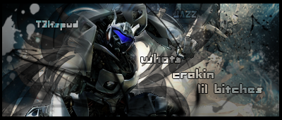
1st
pro
color choice
choice of render
size of tag
text
con
monotoned in effect colors especially in the red area
blend the render/hammer bro better into the tag for a more realistic feel
3d vs 2d, its always a constant battle. :\
cutting of render is very choppy, high quality is always better, unless whole thing is similar ya know
2nd
pro
its blended
color choice
ironman ftw
effects done to render
background is cool
render quality is great
splatter is always win in my books
con
text is kinda hard to read and visible
contrast is off, its too dark man.
lighting is weird
3rd
pro
the effects are cool
optimus prime is a firetruck so thus cool
color choice
text is awesome
font is cool too
wat u did to his eyes shows progressions thats pro
con
contrast in some areas are either too low or too high
kinda too dark overall
so just keep reading tuts if ya want, always do something new in each tag, EXPERIMENT FTW, learn the fundamentals and try to apply them in each tag.
good work man. i want to see more!
-
thanks for all of the comments im trying loads of different combinations of stuff. i agree with whoever said the iron man text is to ermm hard to read ill sort that soon but thanks for all of the comments and btw does anybody have any good resources i can use im stripped for good resources atm. also how can i bled it with the background is that using the lasso and feather? because i tried that on optimus and quite personally i dont know what i did to optimus's eyes ill scan the pdf for the edit so i know to use it :P
thanks as welll for telling me what size to use. this help will be taken on board with me next creations but i only aspire to create such cool works such as all of yourselfs :P
thanks every1 so far
-

ok heres the edit using all of your help i have lightened it using soft white brush then using soft light blending i think. but its also got a brightness and contrast layer to lighten it further. linda i have got 2 c4d's in here but the problem is when i download them and try to open in photoshop it says something about file format unable to parse? so i have to insert the unsaved render and delete the unwanted bits by myself.
but please tell me if this new edit is better
also where can i get c4d's im using planet renders atm and another site for my renders but c4d's im finding harder to locate so could someone hit me up with a link?
Last edited by t3hspud; 08-17-2009 at 09:11 PM.
-
Deviantart.com and theres a resource section on this site
My Three Rules Of Making a Sig Flow, Lighting and Depth
Similar Threads
-
By Killa_GFX in forum Sigs & Manips
Replies: 5
Last Post: 06-16-2009, 11:58 PM
-
By Turnitdown in forum Digital Art
Replies: 14
Last Post: 06-16-2009, 12:08 AM
-
By Dungus in forum Digital Art
Replies: 3
Last Post: 05-24-2009, 01:36 PM
-
By SPeCiaL DeLiVeRY in forum Sigs & Manips
Replies: 2
Last Post: 09-21-2005, 03:51 AM
-
By Xelis in forum Sigs & Manips
Replies: 3
Last Post: 03-11-2005, 04:54 PM
 Posting Permissions
- You may not post new threads
- You may not post replies
- You may not post attachments
- You may not edit your posts
-
Forum Rules
|


 Reply With Quote


