GFXVoid Graphic Design Forum

Remove Text Formatting
Loading...

» Online Users: 512

0 members and 512 guests
No Members online

» Site Navigation

 > FAQ

» Stats

Members: 35,443
Threads: 103,072
Posts: 826,684
Top Poster: cc.RadillacVIII (7,429)
Welcome to our newest member, Lekelindids
Results 1 to 5 of 5

Thread: wut upzzzz

  1. #1
    Join Date
    May 2008
    Posts
    437

    Default wut upzzzz

    I made a sig. I don't make many. C&C?


  2. #2
    Join Date
    Apr 2009
    Location
    somewhere far far away
    Posts
    90

    Default

    It's ok, but the light takes away from the focal and the text is bad.

  3. #3

    Default

    mhmmm.. i thnk its awesome.. Text is sweet aswell as the lighting.. Come on blink x

  4. #4
    Join Date
    May 2008
    Posts
    437

    Default

    I appreciate both of your comments, but if you say the text is bad... what do you mean? The font or the mask?


  5. #5
    Join Date
    Oct 2008
    Location
    Holland
    Posts
    332

    Default

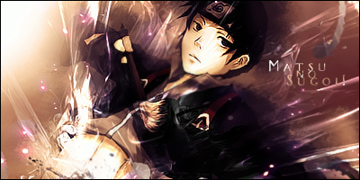
    I love the overall, but just like the other people said the text ruins it imo but i hate every sigs Text especially in my own sigs cuz i suck so badly at it )
    IN MY OPINION, the text is a little meh because of the clipping masks colors into it, and the big size. i would try to try some diffrent Sizes in ur text and placing it closer to eachother. but ofcourse im just a Text newby.. besides from the text i definitly LOVE the sig, if you have any spare-time or when ur bored or something feel free to make me a tutorial hehe!

    keep it up^^

Posting Permissions

  • You may not post new threads
  • You may not post replies
  • You may not post attachments
  • You may not edit your posts
  •  
Powered by vBadvanced CMPS v4.1.1