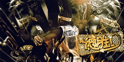
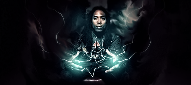
GFXVoid Graphic Design Forum

Remove Text Formatting
Loading...

» Online Users: 1,279

0 members and 1,279 guests
No Members online

» Site Navigation

 > FAQ

» Stats

Members: 35,443
Threads: 103,072
Posts: 826,684
Top Poster: cc.RadillacVIII (7,429)
Welcome to our newest member, Lekelindids
Page 1 of 2 12 LastLast
Results 1 to 10 of 13

Thread: Nobunaga Oda

  1. #1
    Join Date
    Jul 2009
    Posts
    230

    Default Nobunaga Oda

    Here's my new sig

    i still thinking about the text so..

    iamde another sig without text

    Wich one is the best?


    CnC please


  2. #2

    Default

    Both great man! but i cant see text on one of them.. if any ide say the first one x

  3. #3
    Join Date
    Oct 2008
    Location
    Holland
    Posts
    332

    Default

    There's like ALOT going on, wich takes away the flow. The vocal is also kinda.. busy because the C4D takes away ur focus, so that's not that good.

    i suggest you could read up some tutorials and try them out, it seriously will help you out big time.

    Keep it up ^^

  4. #4
    Join Date
    Jul 2009
    Posts
    230

    Default

    Thanks all.. I love your comments..


  5. #5
    Join Date
    Aug 2009
    Location
    Amsterdam, Holland
    Posts
    56

    Default

    I like the energy it radiates. Yeah, it's kinda busy, but if that's what you're going for, that's cool imo. I dig the first one a bit more, since the colors are a bit warmer and vivid. I'm not sure about the abstract brush in the front left though... It's very much 'there'. Can't decide if that's good or bad tbh, haha. Nice work overall
    Some 'classic' from me, got several hundreds, just randomly picked one.. fresh ones will come ofc

  6. #6
    Join Date
    Aug 2009
    Posts
    107

    Default

    i like the second more. the first one's face is like an orange color, while the second one's face looks more natural. just clean up the sig some and youll be fine

  7. #7
    Join Date
    Jul 2009
    Posts
    230

    Default

    Haha thx.. Anyway.. What do you mean "clean up"?


  8. #8
    Join Date
    Aug 2009
    Posts
    107

    Default

    i mean get rid of some of the messy effects, especially on the right side of the sig

  9. #9
    Join Date
    Jul 2009
    Posts
    230

    Default

    Okay.. I get it.. Thanks..


  10. #10
    Join Date
    Nov 2008
    Location
    Costa Rica
    Posts
    264

    Default

    Really like them both, but its true.... theres like a lot going on... but still, those sig are great. I can't give u any real advice on the text stuff, cause I think Im not very good at text, so..... good luck with that!
    .:|Favorite|:. - - - - - .:Newest:.

Posting Permissions

  • You may not post new threads
  • You may not post replies
  • You may not post attachments
  • You may not edit your posts
  •  
Powered by vBadvanced CMPS v4.1.1