GFXVoid Graphic Design Forum

Remove Text Formatting
Loading...

» Online Users: 5,759

0 members and 5,759 guests
No Members online

» Site Navigation

 > FAQ

» Stats

Members: 35,443
Threads: 103,072
Posts: 826,684
Top Poster: cc.RadillacVIII (7,429)
Welcome to our newest member, Lekelindids
Results 1 to 5 of 5

Thread: GOW

  1. #1
    Join Date
    Aug 2009
    Posts
    107

    Default GOW

    not really sure about this one...


  2. #2
    Join Date
    May 2009
    Location
    Land of the Free, and Home of the Whopper
    Posts
    51

    Default

    I actually think it's pretty good. Has a good concept and depth. Great work!
    .:My Favorite:.

  3. #3
    Join Date
    Nov 2008
    Location
    Costa Rica
    Posts
    264

    Default

    Maybe a border and good text should do it imo. Nice sig though
    .:|Favorite|:. - - - - - .:Newest:.

  4. #4
    Join Date
    Jun 2009
    Posts
    66

    Default

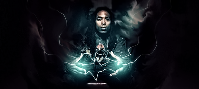
    the lighting is on the wron side. blue clashes with the orange too. nice flow n angle tough

  5. #5
    Join Date
    Aug 2009
    Location
    Scotland
    Posts
    10

    Default

    looks pretty sweet to me man

Posting Permissions

  • You may not post new threads
  • You may not post replies
  • You may not post attachments
  • You may not edit your posts
  •  
Powered by vBadvanced CMPS v4.1.1