GFXVoid Graphic Design Forum

Remove Text Formatting
Loading...

» Online Users: 1,464

0 members and 1,464 guests
No Members online

» Site Navigation

 > FAQ

» Stats

Members: 35,443
Threads: 103,072
Posts: 826,684
Top Poster: cc.RadillacVIII (7,429)
Welcome to our newest member, Lekelindids
Results 1 to 7 of 7

Thread: GI Joe

  1. #1
    Join Date
    Aug 2009
    Posts
    48

    Default GI Joe


    couldnt get what i was going for.
    -from joekz tut-

  2. #2
    Join Date
    Aug 2009
    Posts
    107

    Default

    i like it dude, but try to bring you focal a bit more

  3. #3
    Join Date
    Sep 2008
    Location
    Australia
    Posts
    2,310

    Default

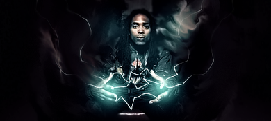
    It's a little dark and difficult to view. This is because your background is the same shade of black as the character.
    Some more colours or a dark grey may help out as a base colour.
    Overall, it does look good and it's a nice tag.

  4. #4
    Join Date
    Sep 2009
    Posts
    27

    Default

    I like what you were going for. Sig has a nice feel to it. Just needs better lighting and more of a focal.


  5. #5
    Join Date
    Sep 2009
    Location
    my room
    Posts
    23

    Default

    its good, just few things really...
    only thing that really stands out at a glance to me was the bg, just seems there, text could use some work, and id say maybe tone down the use of tech (i.e. the left side seems to be a bit cluttered)
    Nonetheless it is a good tag as stated
    gj

  6. #6
    Join Date
    Aug 2009
    Posts
    48

    Default

    thanx guys
    -from joekz tut-

  7. #7
    Join Date
    Aug 2009
    Location
    jamaica
    Posts
    520

    Default

    sig is way too dark imo. it needs some lighting and it'll be fine.

Posting Permissions

  • You may not post new threads
  • You may not post replies
  • You may not post attachments
  • You may not edit your posts
  •  
Powered by vBadvanced CMPS v4.1.1