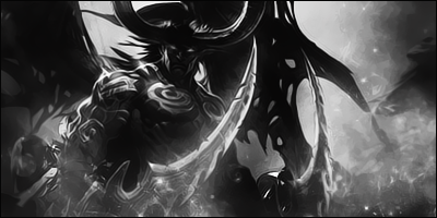
Some of the Distortion is a bit whack, but you have some nice colours and flow in the Signature. It might look better if you were able to blend him more into the background, and if the text was a bit more visible. Still, it's a great sig.
Random Videos// Vader & Emperor Dance-off Star Wars Kinect Tamiya TRF 417 Music// Celldweller - Elara Cutline - Die For You (Shock One Remix)
Yes i had some issues with blending, this was probably the best i could have done with this. lol thx for comment ^^
the sig looks great overall, the letdown for me would be the too much ripple effect at the upper right but still i like it... gj
My Latest Work:
Forum Rules


 Reply With Quote


 thx for comment ^^