GFXVoid Graphic Design Forum

Remove Text Formatting
Loading...

» Online Users: 4,592

0 members and 4,592 guests
No Members online

» Site Navigation

 > FAQ

» Stats

Members: 35,443
Threads: 103,072
Posts: 826,684
Top Poster: cc.RadillacVIII (7,429)
Welcome to our newest member, Lekelindids
Results 1 to 4 of 4

Thread: idea

  1. #1
    Join Date
    Aug 2009
    Posts
    107

    Default idea


  2. #2
    Join Date
    Dec 2005
    Location
    FLORIDA!?
    Posts
    989

    Default

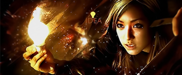
    slightly too sharp in the hair of the chick. hot chick i must say. love them asian chicks .

    text could be dramatically improved. why not give it the same amount of time u did with the sig?

    colors are great. i would love to see more of that red i see towards the center, its an extremely awesome hue to compliment the other colors of the tag.

    btw asian chicks are so hot.


  3. #3
    Join Date
    Aug 2009
    Posts
    107

    Default

    i was trying something different with the text...i guess i failed. thanks for the comments bro

  4. #4
    Join Date
    Dec 2005
    Location
    FLORIDA!?
    Posts
    989

    Default

    its an excellent concept. but dont be scared to give effects to the text as well. dont want to mix 2d with 3d and create an imbalance ya know? didnt work for roger rabbit >_>.


Similar Threads

  1. an idea
    By Spikee in forum The Void
    Replies: 4
    Last Post: 05-16-2006, 10:46 AM
  2. i have no idea
    By Dragon in forum Sigs & Manips
    Replies: 5
    Last Post: 01-29-2006, 12:41 PM
  3. changes and new idea
    By Mynros in forum Sigs & Manips
    Replies: 3
    Last Post: 12-13-2005, 10:50 AM

Posting Permissions

  • You may not post new threads
  • You may not post replies
  • You may not post attachments
  • You may not edit your posts
  •  
Powered by vBadvanced CMPS v4.1.1