0 members and 480 guests
No Members online

» Site Navigation

» Stats
Members: 35,443
Threads: 103,072
Posts: 826,684
Top Poster: cc.RadillacVIII (7,429)
|
-
 New stuff; New stuff;
Can't do any GFX for a while because of school and I'm having a break for a while so I get can get settled into the new year, it's gonna be really hectic this year. Anyway, these are my newest works. 
__________
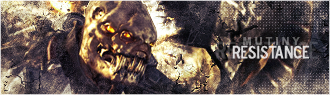
From a tutorial on SigTutorials, was interested in the fact it was all defaults, so decided to give it a go. Learned a lot of new stuff on this one.
__________
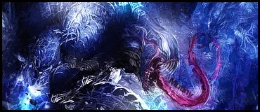
Was going through a really rough patch with my works, so, took a new approach, and it turned out pretty decent in my opinion.
__________
Wanted to do a signature using just defaults, no C4D's, and only one smudge layer and no custom brushes or custom textures. Used mostly motion blurs and brushes.
___________
Comments, Criticism and any tips you have that will help me are greatly appreciated.
-
Ah,first signature is soo tiny xD I think the guy that made this tutorial will be happy from the outcome that you made
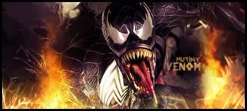
About the second sig,my guess is that if you could just add some sharpen only on c4d the work would be great!
Third signature looks pretty simple,put the frame and make the letters beside render more visible so everyone can read it :P
Nice job done,it looks like you put a lot of effort into this.
-
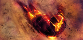
try making the bg on the ironman tag a little bit darker. that would make ironman stand out more. nice job
-
 Originally Posted by Jaszo

Ah,first signature is soo tiny xD I think the guy that made this tutorial will be happy from the outcome that you made
About the second sig,my guess is that if you could just add some sharpen only on c4d the work would be great!
Third signature looks pretty simple,put the frame and make the letters beside render more visible so everyone can read it :P
Nice job done,it looks like you put a lot of effort into this.
# Signature 1
Yeah, the guy in the tutorial said that they were dimensions he used, and since I wanted to expand my concepts, I decided to take the same dimensions. And thanks for the compliment. 
# Signature 2
I didn't use any C4D's on this one, but I'm guessing that you are referring to the fire effects I have on it. If you are, I believe that will be a really good idea. Thanks.
# Signature 3
This one was more trial and error, I just wanted to see what would work, and yeah, it does look simple, you'll be surprised how structured it was though. About 7 gradient maps, a few brightness and contrasts, just to get the feeling and the coloring spot on. And yeah, I like that idea for the text, I just wanted some text on there so it wouldn't get ripped on this other site, but some work, and it could become a big strength on that signature. Thank you, once again.
Originally Posted by prj.sober
try making the bg on the ironman tag a little bit darker. that would make ironman stand out more. nice job
Thanks for the idea, I'll look into darkening the background, and maybe some blurred lighting to bring out the focal more. And thank you for the compliment.
Similar Threads
-
By Kage89 in forum Digital Art
Replies: 4
Last Post: 05-23-2006, 04:13 PM
-
By .Streamline in forum Digital Art
Replies: 3
Last Post: 01-15-2006, 11:46 AM
-
By mindfields in forum Digital Art
Replies: 20
Last Post: 01-09-2006, 07:07 PM
-
By Godhand in forum Digital Art
Replies: 5
Last Post: 12-21-2005, 02:42 AM
-
By anT- in forum Digital Art
Replies: 3
Last Post: 12-13-2005, 03:35 PM
 Posting Permissions
- You may not post new threads
- You may not post replies
- You may not post attachments
- You may not edit your posts
-
Forum Rules
|


 Reply With Quote


