0 members and 5,886 guests
No Members online

» Site Navigation

» Stats
Members: 35,443
Threads: 103,072
Posts: 826,684
Top Poster: cc.RadillacVIII (7,429)
|
-

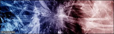
I dont care what you say........... i love this. I used a render i made in C4D.
BTW, i used rabieshund's fracticle BS. It's is a very nice brush set.
-
I like it a lot, great colors and great job on the render, looks damn nice. great job man, keep it up.
-
-
well i say its GREAT lol,,, do you care ? :P
-
not really, cause i already know it is.
-
i could never get my multicolor sigs to come out that well  good work good work
-
well the multicoloring is pretty basic...3 colors not very hard to do. unless you made the render yourself, i don't see much worthy of being called "AWSOME". and by the way, if you expect constructive comments in showcase, don't self-proclaim your own work to be amazing.
-
It's dull. Add more contrast. The text, once again.. looks like you just placed it there. The red on the left looks outta place.. darken that up a bit.
-
Because of this sig...I think RnC should do a TUT on multi-coloring...
I've done it many times aswell and never had it look so great like that..
you can tell the difference in each color and see the transition...
great job man....
-
multicoloring is really basic and the brushing is awful, wont anybody learn that you do not slap fractals over fractals, fractal brushes were made to lighten renders, not to look bad on sigs.
Similar Threads
-
By Runch in forum The Void
Replies: 11
Last Post: 11-22-2005, 04:04 AM
-
By MinorThreat in forum Sigs & Manips
Replies: 16
Last Post: 05-13-2005, 08:56 PM
 Posting Permissions
- You may not post new threads
- You may not post replies
- You may not post attachments
- You may not edit your posts
-
Forum Rules
|


 Reply With Quote

