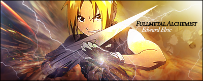
There isn't too much of a focal point. You seem to be trying to direct attention to the palm of his hand, but the first thing I looked at was his face.
The text colour and font doesn't really suit the signature. If you want to use black here, I'd lower its opacity if it were me.
The lightning seems a bit 'arteficial' compared to everything else. It looks okay on the outsides but when it meets the render it just looks too smal and thin.
I generally try to avoid putting a render bang in the middle of my signatures. Maybe a bit to the right and it would look better.
Strengths
The background on the left gives it a flow through the sword (?) and towards the right.
You've used lighting well near the middle top.
The lightning near the end of the sword keeps the flow going through there.
Most of the colours go very well, nothing stick out too much.
The border goes well with the signature.
The idea of the lightning into the hand has some potential. If you try and fix what I mentioned as a weakness, it could turn out really well.
Overall, there's a fair bit you could do to improve, but you have a good base to start on


 Reply With Quote
