0 members and 448 guests
No Members online

» Site Navigation

» Stats
Members: 35,443
Threads: 103,072
Posts: 826,684
Top Poster: cc.RadillacVIII (7,429)
|
-
 For all of you who complain about me never posting tags. For all of you who complain about me never posting tags.
....here's your chance to tear one of mine apart. lol
The theme for this weeks SOTW was appealing so I figured why not.
SOTW version:
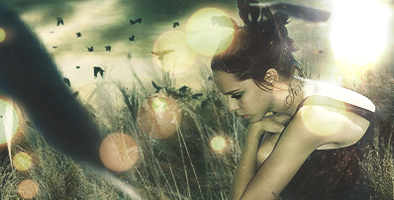
personally I prefer my version with no text...really strange that we're required to put our username in the tag when it's posted right next to the tag in the voting thread..no biggie I guess.
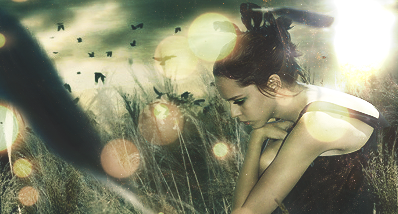
Real version:
-
i like it but there seems too be too much light going on it it man the sotw version looks better it looks like she has a tat and isnt a sweet little girl hahaha good stuff tho man
-
<3 the stock, i think the light in the corner is way too bright, and the lights to the left are distracting.
In all deepest reality, we may only imagine the days past us, knowing that anything and all happens; and time will never be written until the happening... The future is 'eXcellence'.
eXx
-
@ Underoath: yeah making the text look like a tattoo was the only way I could get the text in without disrupting the scene. It looks pretty natural so it's not distracting 
@exorcist: getting the girl to fit into the wheat field stock was a real pain tbh.
If you think about the light source though it's really not that overly bright. If you take a picture with the sun in it, it really shows through brightly, so it's realistic. Plus in a field there are all kinds of dust particles that show up as blotches on photos which are the out of focus lights.
-
Wow, I really like how you made the text blend in so well.
It really does look like a tatoo.
Latest:

-
-
 Originally Posted by (-)Ion

@ Underoath: yeah making the text look like a tattoo was the only way I could get the text in without disrupting the scene. It looks pretty natural so it's not distracting
@exorcist: getting the girl to fit into the wheat field stock was a real pain tbh.
If you think about the light source though it's really not that overly bright. If you take a picture with the sun in it, it really shows through brightly, so it's realistic. Plus in a field there are all kinds of dust particles that show up as blotches on photos which are the out of focus lights.
ah ok i c what your saying, i think the opacity of the dust particles needs to be lowered then and maybe a slightly less saturated color
In all deepest reality, we may only imagine the days past us, knowing that anything and all happens; and time will never be written until the happening... The future is 'eXcellence'.
eXx
Similar Threads
-
By dragoneye in forum Sigs & Manips
Replies: 2
Last Post: 02-17-2009, 05:36 PM
-
By HellBlitz in forum The Void
Replies: 1
Last Post: 10-05-2008, 05:13 AM
-
By Unforgotten in forum The Void
Replies: 2
Last Post: 05-28-2005, 08:46 PM
 Posting Permissions
- You may not post new threads
- You may not post replies
- You may not post attachments
- You may not edit your posts
-
Forum Rules
|


 Reply With Quote


