0 members and 4,117 guests
No Members online

» Site Navigation

» Stats
Members: 35,443
Threads: 103,072
Posts: 826,684
Top Poster: cc.RadillacVIII (7,429)
|
-
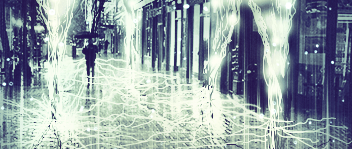
 Ride The Lightning Ride The Lightning
Okay, not actually ride it but still....
...
...
Stock + Pentool with mouse and nothing else.
-
Very plan, IMO - but it works.
-
I just didnt want to spam it with effects. 
-
plain and mono toned needs to be colorful not just 1 color keep workin tho mane i do like the lightning floor
-
That's a lot of pen-tool 
Not sure though whether that much effort was worth it visually, though. A lightning stock on a vanishing point plane would create about the same effect (in much more cheapskate way, of course).
An IMO you've overdone with floor lightning in the middle (next to the guy) and along the right side of the street. A bit more visible cobble-stones would add a bit more interesting detail.
And I like the color of the V3, it quite realistically depicts how surroundings look like when lightning is the only light source. But talking about light sources: you should remove the shadow from the man, he has two stong lightnings to left and right and none strong behind his back.
Nice to see some new styles from you again.
-
 Originally Posted by rewritable

That's a lot of pen-tool
Not sure though whether that much effort was worth it visually, though. A lightning stock on a vanishing point plane would create about the same effect (in much more cheapskate way, of course).
Come on, i got learn something")
Originally Posted by rewritable
An IMO you've overdone with floor lightning in the middle (next to the guy) and along the right side of the street. A bit more visible cobble-stones would add a bit more interesting detail.
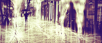
As you can see there is lots of lightning in the front. As distance increases, more lightning is packed into small vision space and so looks more crowded.So the farther it is, more the lightning.
Originally Posted by rewritable
And I like the color of the V3, it quite realistically depicts how surroundings look like when lightning is the only light source.
Yeah, that was the original color choice but i added more later.
Originally Posted by rewritable
But talking about light sources: you should remove the shadow from the man, he has two stong lightnings to left and right and none strong behind his back.
If you go by logic of having 5 lightning bolts and whole grid of lightning, the whole tag should be white, so i let this shadow slip in.
Originally Posted by rewritable
Nice to see some new styles from you again.
 Thankssss Thankssss
-
i dont think its plain, i do like the monotone effect, but i think there should be a little more color to it. and i think some of it is too sharp, u should blur some of it, and sharpen around the person to bring out a better focal.
In all deepest reality, we may only imagine the days past us, knowing that anything and all happens; and time will never be written until the happening... The future is 'eXcellence'.
eXx
-
The details are high in number and short in size. Sharpening will lead to pixelation and blurring destroys depth in such tags ;p
-
Originally Posted by rockerdish
The details are high in number and short in size. Sharpening will lead to pixelation and blurring destroys depth in such tags ;p
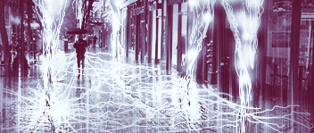
if your saying that about mine, then, shit your pretty much right cuz i failed at that, but back to yours, maybe its better as an lp, because your right there is much detail, and obviously very little room.
In all deepest reality, we may only imagine the days past us, knowing that anything and all happens; and time will never be written until the happening... The future is 'eXcellence'.
eXx
-
Lots of areas are too sharp. Lower the opacity just a bit, 5-10%, instead of blurring. As mentioned before, this is a pentool overkill. Sometimes one more stroke is just too much.
Similar Threads
-
By Shadow in forum Digital Art
Replies: 1
Last Post: 10-29-2006, 08:39 AM
-
By mannos in forum Digital Art
Replies: 11
Last Post: 07-04-2006, 05:28 PM
-
By BLiZZ in forum Digital Art
Replies: 2
Last Post: 10-22-2005, 04:29 AM
-
By Sobek in forum Digital Art
Replies: 10
Last Post: 08-31-2005, 02:59 PM
-
By .Pyr0 in forum Sigs & Manips
Replies: 13
Last Post: 08-23-2005, 11:38 AM
 Posting Permissions
- You may not post new threads
- You may not post replies
- You may not post attachments
- You may not edit your posts
-
Forum Rules
|


 Reply With Quote