0 members and 8,511 guests
No Members online

» Site Navigation

» Stats
Members: 35,443
Threads: 103,072
Posts: 826,684
Top Poster: cc.RadillacVIII (7,429)
|
-
-

putting text in all of these is killing them. none of it looks good
-
i disagree, i like the text on most. it very well might be because i suck at text (partially cause photoshop 6.0 only has six fonts that work, one of which being korean... and the A, F, H, O, R, T, W, and X come up as those unknown character squares when typing in korean...) i think they all fit really well...
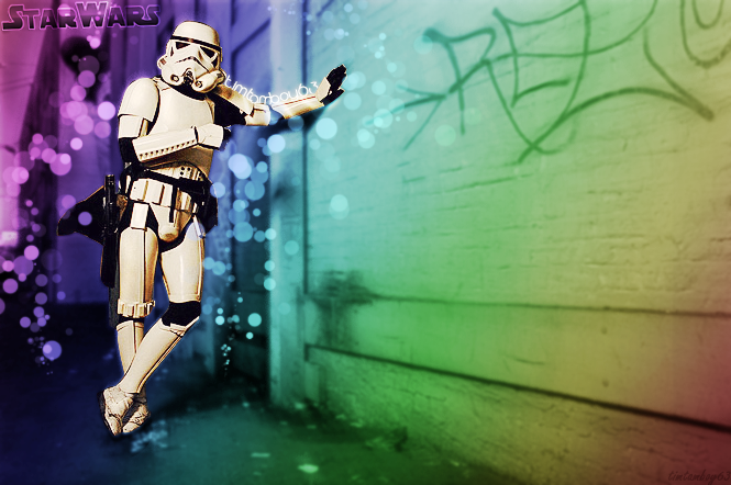
i think for the last one, the hand against the wall looks really bad. the rendering was sloppy there, and the quality should be the same for both spots, but it isnt. the wall is too blurry while the hand is too sharp, making them look disconnected. same problem with the feet. on the first "messing with c4d" the pixelation looks really bad, well really for all of them, they just look slapped onto a background...
i love allllllll your sigs except the eye one, but thats just cause the colour focus disagrees with the object focus (with an enlarged picture of an eye, the focus is always the pupil, but the white 'shine' totally takes your eyes away from the focus point)
the one where he's blowing fire looks pretty good, accept the fire looks kindof out of place in relation to his mouth. in real life if someone were to do that, the fire would be a few inches away from their face, but this one kindof looks like lighter fluid is dripping out of his nose and his lips are somehow hot enough to light it. also the lighting on his neck isnt right, his chin would block the light source but it makes it look like the light is coming from below his chin...
much to the contrary of what you're prolly thinking right now, i actually really like most of your work. its all got really great colour themes, and i love how you're not afraid to use bold colours in a dim light setting. i feel like you've really got a grasp on connecting the focus object with the colours and making that connection portray the theme. all of your stuff looks really amazing, keep it up ^.^
-
Thanks for the CnC guys 
And yeah, the ones near the bottom and most of my LP's are really relly old :P
Biut yeah, thanks for the CnC
and Ion, i know my text sucks :P
Dont visit very often 
If ya feel like catching up i can be fo.nd on my msn:
timtamboy63@wanted.ws
or aim
timtamboy63

-
The mister_x one was teh secks.
Nice, but yeah, I would try some tuts on text.
I assume you are Australian?
-
lol yeah, howd u know?
also anyone got some decent tuts on text?
Dont visit very often
If ya feel like catching up i can be fo.nd on my msn:
timtamboy63@wanted.ws
or aim
timtamboy63
-
Papa's got one around here.
And I know cos only Australians know about tim tams 
-
haha lol, i thought Arnotts(i think they make em) was worldwide ?
Heh maybe not :P
Dont visit very often
If ya feel like catching up i can be fo.nd on my msn:
timtamboy63@wanted.ws
or aim
timtamboy63
-
some are very lq. i personaly like the c4d's
-
I know it's shocking but for once and this once only i agree it Ion. The text kinda does kill half of them because its just out of place. The Morp girl stock sig could be brilliant but the text is really killing it. Also if her eyes were normal lol. Some good work though mate. Keep it up.
Similar Threads
-
By SSSSK in forum Sigs & Manips
Replies: 1
Last Post: 08-02-2009, 12:38 PM
-
By Audio. in forum Sigs & Manips
Replies: 3
Last Post: 10-06-2008, 08:25 PM
-
By Hellion in forum Digital Art
Replies: 7
Last Post: 02-12-2008, 03:06 PM
-
By Fort_of_Shadows in forum Sigs & Manips
Replies: 4
Last Post: 03-26-2006, 01:14 AM
-
By AgainstAllOdds in forum Battlegrounds
Replies: 10
Last Post: 11-08-2005, 12:14 PM
 Posting Permissions
- You may not post new threads
- You may not post replies
- You may not post attachments
- You may not edit your posts
-
Forum Rules
|


<messing with c4d
<messing with c4d
<messing with c4d


 Reply With Quote


