GFXVoid Graphic Design Forum

Remove Text Formatting
Loading...

» Online Users: 5,245

0 members and 5,245 guests
No Members online

» Site Navigation

 > FAQ

» Stats

Members: 35,443
Threads: 103,072
Posts: 826,684
Top Poster: cc.RadillacVIII (7,429)
Welcome to our newest member, Lekelindids
Page 1 of 2 12 LastLast
Results 1 to 10 of 13
  1. #1
    Join Date
    Feb 2009
    Location
    Portsmouth
    Posts
    2,970

    Default Selena Gomez tag

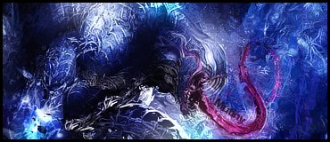
    So I've not made anything in the last couple of months and I started messing around with some inspiration from Muffuns Miley Cyrus tags.
    I started messing around, really not liking it much so far but I was wondering whether people could give me some ideas on what to do next. Literally only 10 layers at the moment - lost on where to go next.
    Work on it? Bin it?

    The text is simply there to stop people that may want to rip it from ripping it.

  2. #2
    Join Date
    May 2009
    Posts
    232

    Default

    id say work on it some more and see what you can do

  3. #3
    Join Date
    Feb 2009
    Location
    Portsmouth
    Posts
    2,970

    Default

    Can you give me some tips or some ideas - really lost on what to do now. Just looked at it for an hour yesterday. Even those 10 layers took me an hour and a half. D:

  4. #4
    Join Date
    Apr 2008
    Location
    Sweden
    Posts
    7,429

    Default

    e m p t y

    The c4d's thats there now isn't working at all :/

    The pink stuff just breaks the flow, try to follow her hair. Shes the leader

    Double text is bad, try to put the Dom over Selena instead, keep them together.

    Work with the background before you start adding effects to the foreground.

    I would say start over fresh again ^u^


  5. #5
    Join Date
    Jul 2009
    Location
    England
    Posts
    52

    Default

    Give it some smudging. To get your focal point back, duplicate the stock and set to darken unless it's a render. Then add a stock background or something? Anything to lighten the tone and make it more interesting to look at.

  6. #6
    Join Date
    Feb 2009
    Location
    Portsmouth
    Posts
    2,970

    Default

    Can you expand on that please Mutiny, seems like a good idea but didn't understand 100%. And thanks for the comment Radillac.

  7. #7
    Join Date
    Jul 2009
    Location
    England
    Posts
    52

    Default

    Quote Originally Posted by Dom View Post
    Can you expand on that please Mutiny, seems like a good idea but didn't understand 100%. And thanks for the comment Radillac.
    Are you using a stock with a white background? Or a render?

  8. #8
    Join Date
    Feb 2009
    Location
    Portsmouth
    Posts
    2,970

    Default

    Stock with a white background.

  9. #9
    Join Date
    Jul 2009
    Location
    England
    Posts
    52

    Default

    Quote Originally Posted by Dom View Post
    Stock with a white background.
    Duplicate the stock layer.
    First one; smudge it around.
    Duplicate ; set to Darken. It brings your focal point back. ;D

  10. #10
    Join Date
    Aug 2009
    Posts
    345

    Default

    i'd suggest rendering it out and putting it over a more suitable background. it's over a white bg too so that'll make the hair a ton easier to do, don't even really have to worry about rendering that.


Posting Permissions

  • You may not post new threads
  • You may not post replies
  • You may not post attachments
  • You may not edit your posts
  •  
Powered by vBadvanced CMPS v4.1.1