GFXVoid Graphic Design Forum

Remove Text Formatting
Loading...

» Online Users: 3,467

0 members and 3,467 guests
No Members online

» Site Navigation

 > FAQ

» Stats

Members: 35,443
Threads: 103,072
Posts: 826,684
Top Poster: cc.RadillacVIII (7,429)
Welcome to our newest member, Lekelindids
Page 1 of 2 12 LastLast
Results 1 to 10 of 11

Thread: Trafalgar Law

  1. #1

    Default Trafalgar Law

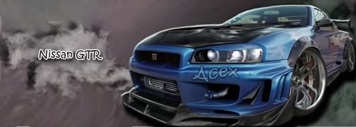
    well...im new to the forum and have been working with photoshop on and off...this is a side piece that i've been working on and just needed some help as to how i can improve it


    ps:the render was a drawn picture so its yeah...its kinda a bad quality render

  2. #2
    Join Date
    Oct 2009
    Location
    NC
    Posts
    2,136

    Default

    pretty nice, i dont like the pluses/crosses on his staff

  3. #3
    Join Date
    Jul 2009
    Posts
    245

    Default

    the bg is nice but the render pretty much kills it all XD plus it doesnt have much depth

  4. #4
    Join Date
    Feb 2007
    Location
    American by birth, southern by the grace of God.
    Posts
    2,564

    Default

    I mean besides the fact the render is LQ. Its good to me IMO

  5. #5
    Join Date
    Oct 2009
    Location
    jersey
    Posts
    158

    Default

    i think the stuff you used in the BG should be in front of the guy.


  6. #6
    Join Date
    Oct 2009
    Location
    Boston
    Posts
    76

    Default

    Bg is nice render def needs some work


  7. #7
    Join Date
    Oct 2009
    Location
    The Netherlands
    Posts
    2,776

    Default

    i find this to chaotic, i don't know where to look. i'd simplify it.. a lot.

  8. #8

    Default

    mhm....i just tried changing the render...dunno if its better or not but i did try to make the bg look somewhat more "soothing" lol


  9. #9
    Join Date
    Sep 2009
    Location
    Sweden
    Posts
    727

    Default

    Defiantly alot beter, you could prob get abit more of the colour fullness of the first one into the second one and i dont rly know if you tried to blend in the render but something you could to is let some of the background lap over the lower part of the render( just small parts of it like dots/stars or flowers)

  10. #10
    Join Date
    Jun 2009
    Location
    Bracknell, England.
    Posts
    766

    Default

    I agree second one is better but it's not a sig 0.o it's more digital artwork than signature, If it was supposed to be a vert 450 high by 250 or slightly bigger is the right size.


Posting Permissions

  • You may not post new threads
  • You may not post replies
  • You may not post attachments
  • You may not edit your posts
  •  
Powered by vBadvanced CMPS v4.1.1