0 members and 5,714 guests
No Members online

» Site Navigation

» Stats
Members: 35,443
Threads: 103,072
Posts: 826,684
Top Poster: cc.RadillacVIII (7,429)
|
-
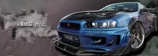
 Basshunter Basshunter
Hey guys,
I think techniqually speaking this is my best work yet.

Was made for a friend in my Gaming clan.
CnC apriciated
-
it is very very bright try to tone it down a lil bit but its just a suggestion
-
i agree, its very bright.
It is also extremely hectic, there is either, 1. to many c4ds, or 2. to much of one c4d showing. I also feel that the render is not blended well. The text is nice.
Good work bro
-
It's not bright 0.o my early stuff was bright lol, this is about medium brightness. ty for the comments anyway guys, anyone else? That can't seriously be all anyone has to say?
-
the sig isnt bright, but the render is not blended in with the bg very good, and the bg itself is way too chaotic, the light source isnt right, and the white border isnt goin well with this sig
In all deepest reality, we may only imagine the days past us, knowing that anything and all happens; and time will never be written until the happening... The future is 'eXcellence'.
eXx
-
ok, if the sig isnt bright, then the colors of the c4ds are bright, are there are too many of those anyways. Erase some parts of them
-
ur focal point cud not easily be recognize becoz of the use of c4ds, its messy/chaotic, better if u choose a colored BW c4d suiting ur render, u can darken the sides to make up ur focal better. but nice compo and text, just suggesting. kiu NF
-
hmm.. i'd make it bw, or color the dude. (or parts of him). further there is to much going on. imo the lines don't match with the curvy c4d's. i can see you did some applied images on the lines, but i feel it didn't work out. Techniqually it may be hot, but that doesn't automaticly means it looks right. Finally; black borders would make it better imo.
From scratch, just smudging the XL way
-
kl thx guys will have a look in when i get home.
 Posting Permissions
- You may not post new threads
- You may not post replies
- You may not post attachments
- You may not edit your posts
-
Forum Rules
|


 Reply With Quote