0 members and 3,767 guests
No Members online

» Site Navigation

» Stats
Members: 35,443
Threads: 103,072
Posts: 826,684
Top Poster: cc.RadillacVIII (7,429)
|
-
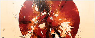
 Saber Saber
I've been working all day on this sig. PS has been kicking my butt lol

-
That's nice!
It has a cool rave sort a feel and I'm loving the colours. Nice work. 
-
Really nice. Colours are good and the shapes are well positioned. Really like your text and there is some level of depth in the sig. I would suggest taking those red lines and the shape in the upper right corner as well add some contrast. Mess with the levels a bit.
Nice work otherwise.
 Originally Posted by Slave
takken, you sweet boy you, i could eat you 6^
-
ooo...always wanted to make a sig like this...if you dont mind..can u send me the psd for it?...i needa learn how to start making sigs like that...thanks if you do...btw my email is [Removed] if ya decide to send it
Last edited by Nutter; 11-05-2009 at 08:06 PM.
Reason: Removial of E-mail Address
-
Try to keep personal details like E-mail Addresses in the PMs. Publicly displaying them can draw unneeded attention from Spam Bots and such.
-
this 1 is alright, i think the random red c4d to the left shouldnt be there a and i think the colors should be cooled down a bit (less reds oranges etc) and i dont like the txt
the composition is alright but could be better, i like the purple, but its not matching the other warm colors of this tag, u should make a v2
Originally Posted by Takken

Mess with the levels a bit.
Nice work otherwise.
work on that and the curves too, sry for double post 
Last edited by Nutter; 11-05-2009 at 08:23 PM.
Reason: Post Merged.
In all deepest reality, we may only imagine the days past us, knowing that anything and all happens; and time will never be written until the happening... The future is 'eXcellence'.
eXx
-
very nice work shannon. The colors are nice and you have some neat vector style stuff going on. I personally feel its alittle hectic, but thats just me. The text blends nicely with the tag, but im not super fond of it.
Overall its well done and unique. good job
-
v.2 The orange thing looked out of place so I toned it down.

-
Hmm very nice shannon. I dont actaully like the topaz overlay tho. It is way over used. Alos I find the purple Giant purple out line of the girl very distracting, but it looks really good. Very nice.
-
Similar Threads
-
By MrInsane in forum Sigs & Manips
Replies: 3
Last Post: 10-14-2009, 10:31 PM
-
By MrInsane in forum Sigs & Manips
Replies: 10
Last Post: 08-21-2009, 02:08 AM
-
By 「Chai Child」 in forum Sigs & Manips
Replies: 1
Last Post: 12-09-2008, 03:14 AM
-
By s0ggywaffls in forum Sigs & Manips
Replies: 2
Last Post: 06-09-2007, 04:42 AM
 Posting Permissions
- You may not post new threads
- You may not post replies
- You may not post attachments
- You may not edit your posts
-
Forum Rules
|


 Reply With Quote