0 members and 7,438 guests
No Members online

» Site Navigation

» Stats
Members: 35,443
Threads: 103,072
Posts: 826,684
Top Poster: cc.RadillacVIII (7,429)
|
-
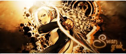
 Need your opinion! Need your opinion!
Hello!!, this is one of the sigs i made,please tell me what you think ^^
-

looks nice. I like it. Maybe make the bottom off the background brighter.
-
It's a bit mono-toned for my liking. I also feel like the light should be a bit more to the left so that it assists with the shadows on the girl.
Your text also seems to be lacking. I think this is more because you have located it in the corner, rather then more in the centre of the sig. 
Overall... It looks good.
-
Thank you both ^^, I'll keep what you mentioned in mind...,
About the text, I don't want to put it in the middle because I think it would mess up
the render...but even though i say that, I haven't realy tried xD
-
This is very nice mate. Only down fall for me is the text is way to big. It distracts too much from the focal point.
-
this is very nice man, good effects, good lighting, text is good as well, but i would lower the font size a bit = keep the focal on the render. Personally i would get rid of the target on her right (the left of the sig) = i just dont feel like a target goes well with it... but hey, thats just me.
this is great man, well done, i look foward to seeing more of your work
-
Ok, I see..the text, I'll work a bit more on that ^^
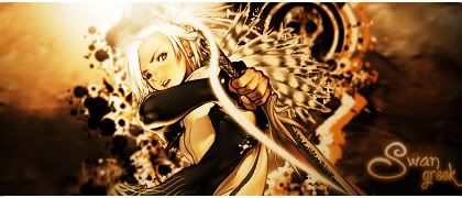
By the way i made another one and thought of posting it here since i made this post today  , feel free to express your opinion in this one too ^^... (lol, i couldn't resist this render! xD) , feel free to express your opinion in this one too ^^... (lol, i couldn't resist this render! xD)
Here it is:

-
Hm dont like it to much. The render is way to distoreted, also it doesnt fit in with the BG. The test is also a little too strong, and finally, the render needs to be blended in more with the BG not just placed on it. Overall I am not a real big fan.
-
Got it  , thx for replying ^^, i'll do better next time , thx for replying ^^, i'll do better next time
-
eh, im not big on the new one, the colors dont match (render vs BG), try blending the render more and adding some gradient maps as well as adjustment layers.
the reder looks distorted= make sure you hold shift when you move your render, and only more it from the corners.
text needs some work, straighten it and blend it more.
Similar Threads
-
By Ritz in forum Sigs & Manips
Replies: 1
Last Post: 02-17-2009, 03:34 PM
-
By valorNstrife in forum Sigs & Manips
Replies: 2
Last Post: 01-28-2009, 07:16 AM
-
By Garis in forum Sigs & Manips
Replies: 2
Last Post: 07-24-2007, 04:31 PM
-
By Dale in forum The Void
Replies: 39
Last Post: 01-02-2007, 11:05 AM
-
By MinorThreat in forum Sigs & Manips
Replies: 2
Last Post: 02-23-2005, 04:33 PM
 Posting Permissions
- You may not post new threads
- You may not post replies
- You may not post attachments
- You may not edit your posts
-
Forum Rules
|


 Reply With Quote


