I'm not usually fanboying for sigs, but I love this A LOT! It really is one of the best sigs I've seen lately.
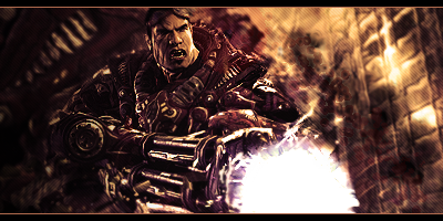
First, all the effects are quite subtle, but every single of of them complement the tag. Wireframes on left create an amaing deep background, while effects in left side background and dark splatters add the necessary randomness factor. The vertical rectangle... not sure what it does but it simply looks cool there.
Light is just beautiful.
Text is really well and accurately done. It blends in with the sig perfectly without being barely readable as most of texts in sigs are. In some magical way it doesn't even draw attention away from focal.
Damn, even border style suits it.
Honestly, I can't find the tiniest flaw in this sig. I'll be happy if I make a sig that I like myself as much as I like this one.


 Reply With Quote


