0 members and 7,741 guests
No Members online

» Site Navigation

» Stats
Members: 35,443
Threads: 103,072
Posts: 826,684
Top Poster: cc.RadillacVIII (7,429)
|
-
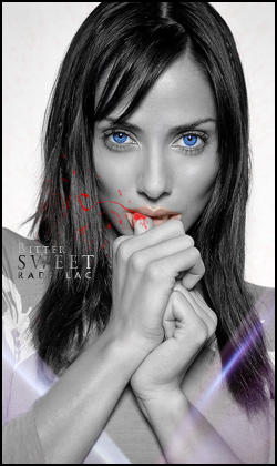
 Imbruglia Bitter Sweet & Itachi Full Moon /Vert Tag's\ ~Radillac~ Imbruglia Bitter Sweet & Itachi Full Moon /Vert Tag's\ ~Radillac~
Two of my latest vert tags. Critique and comments are more than welcome ^u^
Last edited by cc.RadillacVIII; 01-28-2011 at 07:12 AM.
-
1. This is pretty neat, i love the blood coming off her finger, its perfect. I dont like the C4D on top of her. It would be much more clean without it. The lighting on her bottom lip looks alittle fake, it should be slightly darker than her upper lip. Eyes are beautiful. The font of the text is nice, placements not bad, but im not sure about the grad overlay, its makes it alitte hard to read. Great work, love the simplicity!
2. The vector are very well done, none to dark or bright! Text is perfect IMO. The effects of snow you have is wonderful, its not over done, it looks real, and it puts the sig in motion. Exceptional work
-
Wow thank you 
On the text of Imbruglia there is a clip mask with applyed image. Had a hard time to make it look ok, yeah a little hard to read. I thought there were something missing, maybe a c4d were not the answer then ^u^
I'm really pleased with Itachi too
Glad you like em ^u^
-
-
that blue effect on the lower right of the first sig is unnecessary and it isn't giving any focus to the focal point. also, the 'b' in bitter is hard to see.
the second one is good, though, the motion blur kinda ruins the simplicity of it.
-
There is no motion blur on that one, it's brush effects 
I'm gonna make a V.2 on Imbruglia with text change and c4d removal when I got some time 
-
V.2 added!
You may call me Mr. Busy Slowpoke.
-
It took you 2 years to edit it o.o
-
Haha nah I did recall this tag yesterday and edited it then. So it has been forgotten for two years
Last edited by cc.RadillacVIII; 01-29-2011 at 12:39 AM.
Similar Threads
-
By Nutter in forum Sigs & Manips
Replies: 7
Last Post: 11-16-2009, 06:26 PM
-
By DRB_020 in forum Sigs & Manips
Replies: 3
Last Post: 03-09-2009, 11:26 PM
-
By Firescorpio in forum Sigs & Manips
Replies: 2
Last Post: 06-07-2008, 09:36 AM
-
By Chivalry in forum Digital Art
Replies: 0
Last Post: 08-30-2006, 11:55 PM
-
By RoughDraft in forum Digital Art
Replies: 2
Last Post: 08-23-2005, 05:45 PM
 Posting Permissions
- You may not post new threads
- You may not post replies
- You may not post attachments
- You may not edit your posts
-
Forum Rules
|


 Reply With Quote


