0 members and 3,406 guests
No Members online

» Site Navigation

» Stats
Members: 35,443
Threads: 103,072
Posts: 826,684
Top Poster: cc.RadillacVIII (7,429)
|
-

Heres another i made today..
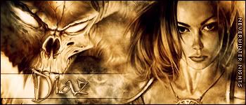
Some C+C please 
-
is that for sotw 13?
bt: its nice good blending but you could bled the hair some more
and eh what text is the "Diaz" text.?
-
Ok thanks, I cant remember what the Diaz text is called.. I'll find out and post it in the thread later 
-
No more comments 
-
mmm.... ahh... right... Thumbs up!
i like it very nice in deed!
nice blending (mine is non existant) nice text and brusing 
-
nice sig. I like the colour scheme you used :P
apparently Neverwinter nights is pretty "in" at the moment it's a really kewl render.
Dont forget to post what font it is, if you can still find it, cuz i like it too :P
the vertical text on the right could be clearer though... try and fix that, then it's awesome
-
Whoa, I LOVE this sig :wub:
The colors are awsome man! Both renders are very cool, and they're both blended in PERFECT!
Also the text owns, it looks amazing, and that thingy behind the text fit with the theme. And I agree with LANfest, the text on the right could be some better, maybe try blendmode smooth?
Min: 9.1/10
-
Thanks guys, Also the font for the main text is called bambino
-
thx alot that is going to get in my next sig!
 Posting Permissions
- You may not post new threads
- You may not post replies
- You may not post attachments
- You may not edit your posts
-
Forum Rules
|


 Reply With Quote
