0 members and 484 guests
No Members online

» Site Navigation

» Stats
Members: 35,443
Threads: 103,072
Posts: 826,684
Top Poster: cc.RadillacVIII (7,429)
|
-
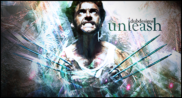
 Unleash. Unleash.
Ok so I tried a larger signature size...
C&c
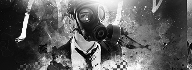 Burn After Rolling
-
too colorful in my opinion
Newest:  ]
My hero: 
-
I would have to agree. Too many colours and far too chaotic. The current tag in your signature is a lot better and in my honest opinion, you should stick to making stuff like that, because it's nice.
-
thanks for the c&c guys 
yeah no I totally went out of my element on this one.. completely different style than my others.
Burn After Rolling
-
-
So one of the guys in my cod2 clan really liked it and thought it would fit well for his name being TheBeast.
So I did a v2 for him as a request
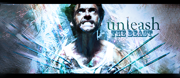
the new:
Skinnier
Photo Filter
movie style border
Burn After Rolling
-
i think the fact that is was larger in size was just throwing people off, because now that you've cut it down and added the border i feel a lot better about it. the only problem i see with it is that on the outer sides you kinda just decided it didnt mean to be bright, although that's great for contrast, it completely throws off the flow of the tag. also no offense but i hate the text you used for "the beast" ... and wolverine himself looks kinda weird, i dont know if you added any effects to the render or not, but it seems like you used some sort of filter on it.... if not, then oh well, its just not a good quality render... if so, then you should take it off and try something else with it.
-
too many different colors and too hectic.
in this case i think you tried to do to much.
keep up the work man!
Similar Threads
-
By Elramo in forum Signature Tutorials
Replies: 3
Last Post: 10-09-2008, 03:40 PM
-
By Papa in forum Digital Art
Replies: 4
Last Post: 03-24-2007, 07:27 PM
 Posting Permissions
- You may not post new threads
- You may not post replies
- You may not post attachments
- You may not edit your posts
-
Forum Rules
|


 Reply With Quote


