GFXVoid Graphic Design Forum

Remove Text Formatting
Loading...

» Online Users: 4,535

0 members and 4,535 guests
No Members online

» Site Navigation

 > FAQ

» Stats

Members: 35,443
Threads: 103,072
Posts: 826,684
Top Poster: cc.RadillacVIII (7,429)
Welcome to our newest member, Lekelindids
Results 1 to 4 of 4
  1. #1
    Join Date
    Sep 2009
    Location
    New Jersey
    Posts
    4,752

    Default Assassin Creed Sig


  2. #2
    Join Date
    Nov 2009
    Posts
    275

    Default

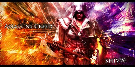
    I like the effects on the render and the coloring but the bg for the most part looks chaotic, needs some kind of flow from the render.

    Try to keep ur text together in a good spot to accent the tag. keep at it cos u jus need some tweaks i think


  3. #3
    Join Date
    Sep 2009
    Location
    The Netherlands
    Posts
    1,732

    Default

    yea I agree with Nexx
    I think it's hard to place you text well when you have 1 line of text
    like you did with assassin's creed.
    You can place it better when you place creed under assassin's or somthing... or you can make the text some smaller.


  4. #4
    Join Date
    Sep 2009
    Location
    New Jersey
    Posts
    4,752

    Default

    kk thx for the feed back guys How bout a rating?


Similar Threads

  1. Assassin Creed
    By jorrne in forum Sigs & Manips
    Replies: 2
    Last Post: 08-27-2007, 06:51 AM
  2. GW Assassin
    By s0ggywaffls in forum Sigs & Manips
    Replies: 1
    Last Post: 08-01-2007, 12:18 PM
  3. assassin's creed
    By Arkanian in forum Sigs & Manips
    Replies: 9
    Last Post: 06-20-2006, 09:59 AM
  4. =: SIlent Assassin :=
    By arson™ in forum Sigs & Manips
    Replies: 14
    Last Post: 09-12-2005, 11:16 AM
  5. Assassin Sig
    By ~lovemma in forum Sigs & Manips
    Replies: 6
    Last Post: 06-19-2005, 03:48 PM

Posting Permissions

  • You may not post new threads
  • You may not post replies
  • You may not post attachments
  • You may not edit your posts
  •  
Powered by vBadvanced CMPS v4.1.1