0 members and 320 guests
No Members online

» Site Navigation

» Stats

Members: 35,443
Threads: 103,072
Posts: 826,684
Top Poster: cc.RadillacVIII (7,429)
|
-
 Anime sig Anime sig
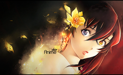
Well here is my newest sig I did in about 15 minutes or so. I would like some CnC but please don't tell me to go look at tuts. For starters, I see no challenge in a "Monkey see, monkey do" scenario which is how I view tuts. You look at, you do it, you achieve the desired effect someone else made before you. I just wish to know what needs work- depth, blending, text, lighting, etc so I can adjust it and make it better through my own means so I can retain my own unique style. I notice far to many people here have sigs with the same general style/brushes used on them. I am Unique and wish to remain so. 
*Side Note* I know it lacks color variation but anyone who has watched the Anime this character is from you would know why that is the one color I used.
Last edited by BlackDragonX; 01-22-2010 at 12:37 AM.
-

well you can never escape from tuts they make the base. you get the idea which steps result in which kind of effects. you have to read them as much as you can. these are the things you can not have at once. see my posts but still i lack in all the terms you wrote here.
So take your time and probably put more time on one sig. instead downloading lots of anime renders and applying the styles on them one by one without taking care of what has been told you here.
coming to ur current sig. its good 15 mints Ah . . . normally it takes a lot time to make a wow sig
nice text though 
in the bg its very monotone . I am msorry but see some tuts. lolz
"You can delay but time will not"
-

Tutorials are the best way to go with most people, i'm not suggesting it's to cripple ur individuality as a designer but try and look at some and adapt to suit you, you don't need to follow it word for word and image for image if you already know how to use photoshop to it's full extent, which i doubt u dnt as most of us dnt.
Your Sig is lacking in something that draws you to the render as a focal rather than the purple bottom left at the end of the coat. This may be because it's a bright spot or it may be where the flow is going.
This also seems to be where your Light Source is coming from which works against the render. Top right hand corner should be where any LS is coming from for this sig.
Your text is a bit dodgy, most words can't be read at first glance and it doesn't fit the sig.
Depth is all a little flat and needs work as do all the other things i've mentioned.
I know your attitude and its similar to KidBuu's. Heres his view on tutorials:
http://www.gfxvoid.com/forums/showthread.php?t=57794
And my reply sums up why u should do them anyway =)
-

^cant really add that much to what they said, but the purpose of tuts are to teach you things you might have never known, a technique or effect, not to follow it word for word.
the sig lacks concept and composition. you have no lighting source, if you look at the render, the lighting is coming from her left (the sigs right). you need to work on creating that lighting.
i understand you want to be unique, i think everyone does, but in order to find your own style you need to understand others styles and techniques, this will make you better.
keep working and posting, gl
-

Agreed with The rest of the Posters. Develop your own style and stick with with.
-
-

I think you're looking at tuts the wrong way, it's not really 'monkey see, monkey do', they're more of a learning experience, whether you follow each step to the point of creating the same outcome is up to you, just read them so you learn new techniques and styles that may fit the best with you.
As for your sigeh, good job with the text, for 15 min I think you did a pretty good job with it, but your focal is immensely suffering because it doesn't blend with the background to well. Your whole sig looks purple yet your render has completely different lighting to it.
Similar Threads
-
By imported_Stoneface in forum Digital Art
Replies: 5
Last Post: 11-02-2006, 03:41 PM
-
By Elektrik in forum Digital Art
Replies: 9
Last Post: 05-07-2006, 12:53 AM
-
By A.FIRE.INSIDE in forum Digital Art
Replies: 5
Last Post: 02-14-2006, 10:51 AM
-
By Virus in forum Digital Art
Replies: 2
Last Post: 10-17-2005, 03:59 PM
 Posting Permissions
- You may not post new threads
- You may not post replies
- You may not post attachments
- You may not edit your posts
-
Forum Rules
|


 Reply With Quote


