0 members and 510 guests
No Members online

» Site Navigation

» Stats
Members: 35,443
Threads: 103,072
Posts: 826,684
Top Poster: cc.RadillacVIII (7,429)
|
-

Very nice, its got a 'neon sign' feel to it. Simple to make, and yet looks like it could have taken ahes. Good work.
.:Latest:.

-
I need a bit of help with this one guys. I want to do this but get stuck on the first step. The tut says to set the background to invisible by clicking the eye. I seem to have a lock on and can't set this to invisible. How do I disengage the lock? Sorry, I know I'm a newb. :huh:
-
on the right side of the layer in the little layers window, there is a lock symbol. double click it and it goes away.
Hey Taco, what font is that? I've been trying to find that font for a while to make my own, and i cant find it...
Thanks!
-
Originally posted by Tiki@Feb 9 2005, 08:17 PM
I need a bit of help with this one guys.* I want to do this but get stuck on the first step.* The tut says to set the background to invisible by clicking the eye.* I seem to have a lock on and can't set this to invisible.* How do I disengage the lock?* Sorry, I know I'm a newb.* :huh:
[snapback]5001[/snapback]
Double click it to turn it into a layer.
-
hey there well, this is a nifty little site i stumbled upon and i'm knew to using Photoshop as well. but here's my dilema...i'm able to do everything that you say and it look like it has the neon effect, but when i try to save it and then i open it...it doesnt look exactly like the way it did in photoshop. so i guess what i'm asking is how do i save it so that it keeps 100% quality in JPEG, or what ever is the most used form on the internet. it's weird though if i open it with an IE Browser it looks like poor quality...but when i open it in Photoshop it looks good again. Neways thnx for the great tutorial.
-
Hi! I`m new here 
and I`m a new and happy user of Photoshop
I`ve one problem with this Glow effect.
At the end is the option "Filter/Render/Clouds"
I don`t have this option  I mean, it is in my menu, but It`s unmarked and I can`t choose this. I mean, it is in my menu, but It`s unmarked and I can`t choose this.
What`s the problem?
Thx 4 help
-
Originally posted by 105thKarnage@Feb 10 2005, 05:21 PM
on the right side of the layer in the little layers window, there is a lock symbol.* double click it and it goes away.
Hey Taco, what font is that? I've been trying to find that font for a while to make my own, and i cant find it...
Thanks!
[snapback]5313[/snapback]
Thanks for the replys to you and Karnage. I had made a promise to myself that I wasn't going to let this beat me, so I looked for the answer in help. I did find it and it was just what you said Taco. Thanks. I like what this looks like too now that I've been able to do it.
-
Originally posted by 105thKarnage@Feb 10 2005, 03:21 PM
on the right side of the layer in the little layers window, there is a lock symbol.* double click it and it goes away.
Hey Taco, what font is that? I've been trying to find that font for a while to make my own, and i cant find it...
Thanks!
[snapback]5313[/snapback]
Air Millhouse Italic (www.1001freefonts.com). Thanks for the great comments everyone!
-
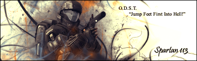
Here is what I've been able to come up with. Please tell me what you guys think.

As you can see I'm working on a sig for my clan forums.
-
well here is the way it looks when i load in on to IE...but it looks different when i load it onto Adobe, the blue is deeper. the way it looks below is it's faded.

if anyone could tell me if it's possible to save it so that it looks like the way it does in adobe. plz help
 Posting Permissions
- You may not post new threads
- You may not post replies
- You may not post attachments
- You may not edit your posts
-
Forum Rules
|


 Reply With Quote