GFXVoid Graphic Design Forum

Remove Text Formatting
Loading...

» Online Users: 656

0 members and 656 guests
No Members online

» Site Navigation

 > FAQ

» Stats

Members: 35,443
Threads: 103,072
Posts: 826,684
Top Poster: cc.RadillacVIII (7,429)
Welcome to our newest member, Lekelindids
Results 1 to 3 of 3

Thread: Bioshock

  1. #1

    Default Bioshock

    just messed around with this one. C&C?


    ----


  2. #2
    Join Date
    Jan 2009
    Location
    The netherlands
    Posts
    378

    Default

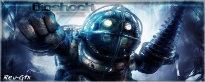
    i think it would look nice if you made the sides slightly darker so there's a bigger
    contrast between the darker parts on the side and the light behind him.


  3. #3
    Join Date
    Dec 2006
    Posts
    1,270

    Default

    Idk if its just me but he looks a little squashed. Make sure you keep it relative when resizing images.
    Besides that not much to say. It is a very nice basic sig. Can't go wrong with that. Just keep making them and find your style. Looks pretty good.
    Fav:


    Newest:


Similar Threads

  1. Bioshock
    By Krank90 in forum Sigs & Manips
    Replies: 6
    Last Post: 01-12-2010, 07:20 PM
  2. Bioshock sig
    By DrPepper in forum Sigs & Manips
    Replies: 1
    Last Post: 06-01-2008, 01:09 PM
  3. Bioshock sig
    By |DannyG| in forum Sigs & Manips
    Replies: 3
    Last Post: 09-17-2007, 01:44 PM
  4. Bioshock
    By s0ggywaffls in forum Sigs & Manips
    Replies: 10
    Last Post: 09-03-2007, 09:15 PM
  5. bioshock
    By mannos in forum Sigs & Manips
    Replies: 4
    Last Post: 10-01-2006, 02:44 PM

Posting Permissions

  • You may not post new threads
  • You may not post replies
  • You may not post attachments
  • You may not edit your posts
  •  
Powered by vBadvanced CMPS v4.1.1