0 members and 1,657 guests
No Members online

» Site Navigation

» Stats
Members: 35,443
Threads: 103,072
Posts: 826,684
Top Poster: cc.RadillacVIII (7,429)
|
-
 new sig: Dante new sig: Dante
My latest signature, i wanted to do a devil may cry signature for a while now,
but they never seemed to turn out any good for some reason.
i would like to try and improve this one some more, so CnC would be welcome 
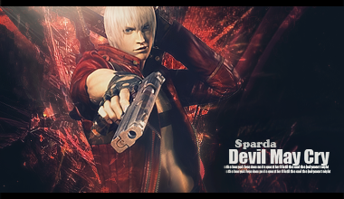
thanks in advance, greetz sparda.
Last edited by Sparda; 02-02-2010 at 06:08 PM.
Reason: typo
-
awesome sig sparda!! I like the depth and flow!!
Nice lighting too :P
But the text is kinda big... lol
Neat sig!
I dont make sigs anymore
-
Eh, It's not as good as your previous signature IMO, but it still looks decent.
The lighting is fine, as well as the depth. Although, I suggest working on your text, it is distracting from the focal.
Favorite

-
thanks for the comments guys
i feel like the sig is unfinished, but im not quite sure what to do with it
and il prolly downsize the text a little, text isnt realy my strong point, but im trying hard to improve that.
just a month back i avoided texting sigs because they where instantly ruined by it lol.
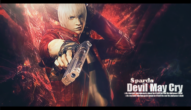
edit:
Messing arround with it a little, but im not sure if its better or worse lol.
Last edited by Sparda; 02-02-2010 at 09:10 PM.
Reason: edit
-
just make the render blend in a liitle.
it looks like its just pasted in.
GJ on the sig tho,
-
All that has been said before but the text is good, just move it a little closer to the focal and change to colors in order to make it blend in better.
Everything else is good 
Similar Threads
-
By _xDeviLx_ in forum Sigs & Manips
Replies: 5
Last Post: 01-18-2010, 06:57 AM
-
By Firescorpio in forum Sigs & Manips
Replies: 2
Last Post: 06-18-2008, 11:12 AM
-
By Lumix in forum Digital Art
Replies: 6
Last Post: 05-10-2007, 09:05 PM
-
By AoD1315 in forum Sigs & Manips
Replies: 5
Last Post: 12-14-2005, 03:25 AM
-
By Kelso in forum Sigs & Manips
Replies: 3
Last Post: 07-10-2005, 04:09 PM
 Posting Permissions
- You may not post new threads
- You may not post replies
- You may not post attachments
- You may not edit your posts
-
Forum Rules
|


 Reply With Quote


