0 members and 1,104 guests
No Members online

» Site Navigation

» Stats
Members: 35,443
Threads: 103,072
Posts: 826,684
Top Poster: cc.RadillacVIII (7,429)
|
-
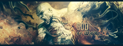
 God of War God of War
-
Nice one!
Text is okay, nice depth, good lighting.
The sig has a nice touch  I love it. I love it.
Keep it up!
Newest


-
 Originally Posted by Touch

Nice one!
Text is okay, nice depth, good lighting.
The sig has a nice touch I love it.
Keep it up!
agreed, good comp, nice effects. nice one!!
From scratch, just smudging the XL way
-
looks nice,
imo i think on the lighting is should be darker on the bottom left corner
cos the light seems to be coming from behind hid head.
-
Originally Posted by tekken
looks nice,
imo i think on the lighting is should be darker on the bottom left corner
cos the light seems to be coming from behind hid head.
i agree with this post.
anyway, i like it, all the basic elements(depth blending etc.) seem to be fine to me.
i also quite like the colouring on it, its fits the tag very nicely in my opinion
nice work
-
nice sig they should come up with God Of War 3
-
I love the effect and depth!
awesome sig man!
I dont make sigs anymore
-
It's pretty nice, though, I personally think the text is a bit overdone.
Latest:

-
thanx for nice comments guys!!
@tekken yeah i know, man :/ the reason i lightened left bottom a bit more is cos effect there would have looked low quality otherwise
-
Favorite and Most Recent  :

 Posting Permissions
- You may not post new threads
- You may not post replies
- You may not post attachments
- You may not edit your posts
-
Forum Rules
|


 Reply With Quote


