0 members and 387 guests
No Members online

» Site Navigation

» Stats
Members: 35,443
Threads: 103,072
Posts: 826,684
Top Poster: cc.RadillacVIII (7,429)
|
-
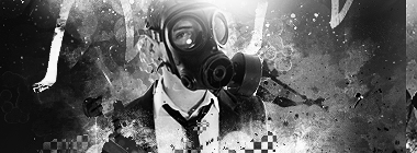
 Halo Halo
Tried something new 
CnC plz 

-
The only thing I see wrong with this is the text.
Other than that, it's great.
Latest:

-
i agree, looks pretty awesome man.
-
Great sig man, everything rocks but the text :P
 Burn After Rolling
-
Thnx for The CnC
I will change the text when i am at home 
-
Great flow.
I actually do like the text. But the lighting isn't perfect 
Newest


-
i dont really like the text and i think its alittle bit toooo bright other than that its good man good to see a new style from you
-
the bright spot distracts a bit and comes from the wrong side. other then that good job!!
From scratch, just smudging the XL way
-
Okay, like everybody said, Text problem. Its abit distracting X.X Try to blend in into the BG itself. Like for example maybe..smudging? but u hav to rasparize(dunno how to spell sorry) the layer. but blending text, i am not a pro so...
Anyway, quite bright isn't it? But i like the brightness though. Maybe set B&W gradient map, set it to multiply and 20% opacity, erase over anything which looks bad. Thats what i sometimes will do.
Overall, its good! Keep it up!
Newst Masterpiece:

Stare HARD
-
Thnx for the CnC again
here is V2:

Similar Threads
-
By [[[tg]]]captain in forum Sigs & Manips
Replies: 2
Last Post: 12-06-2008, 09:07 AM
-
By tekken in forum Sigs & Manips
Replies: 5
Last Post: 11-30-2008, 10:59 AM
-
By BonesMa in forum Support
Replies: 2
Last Post: 11-26-2008, 10:20 AM
-
By nVision in forum Sigs & Manips
Replies: 11
Last Post: 01-26-2007, 08:57 PM
-
By Adam in forum Sigs & Manips
Replies: 6
Last Post: 05-13-2006, 06:34 AM
 Posting Permissions
- You may not post new threads
- You may not post replies
- You may not post attachments
- You may not edit your posts
-
Forum Rules
|


 Reply With Quote


