hmmmm nothing bad to say about it ... but maybe try putting the text somewhere under his arm? like between his arm the gun nozzle? cuz i think it distracts attention being all the way at the bottom
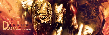
Not liking how the explosion just stops and doesn't show at all from the middle down. Also, smudge the edges of the render to blend it with the background.
hmmmm nothing bad to say about it ... but maybe try putting the text somewhere under his arm? like between his arm the gun nozzle? cuz i think it distracts attention being all the way at the bottom
kk ill try to move the text somewhere
Originally Posted by Karter
Not liking how the explosion just stops and doesn't show at all from the middle down. Also, smudge the edges of the render to blend it with the background.
kk ill try to move the explosion and ill also try to blend the render up


 Reply With Quote